

Notice anything different? 😏
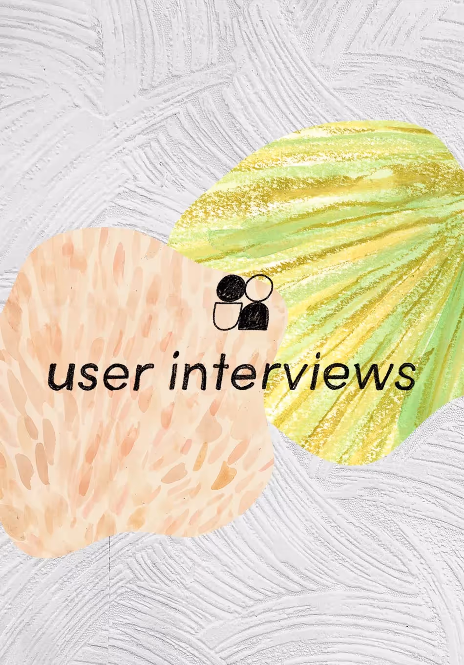
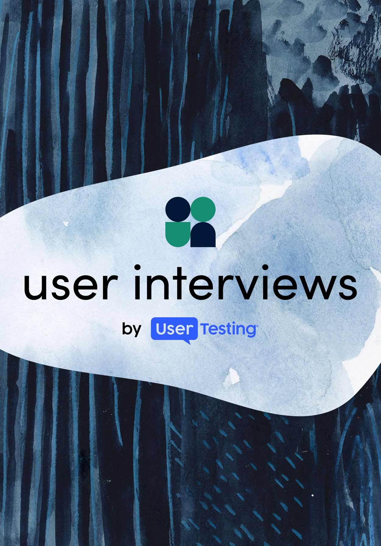
User Interviews officially has a fresh new look 💅.
After several weeks and over a hundred Figma comments later, we’re so excited to share our new logo, brand look, and website with all of you! It’s truly taken a village, but luckily I’ve had an incredible support system throughout this journey. Huge kudos to our product designers and design system folks, my pals on the marketing team, UI’s leadership team, and anyone else who received a Slack DM from me, asking “how does this look?”
We wanted our new brand look to reflect a harmony between cutting-edge and approachable. We seek to embody “the UXR company next door” persona while also conveying speed, reliability, and being a best-in-class product (because we are, hello). We didn’t want to lose sight of our roots; we wanted our existing brand to “grow up” into a more accessible, usable design while still being witty and welcoming.
So if you’re curious about how the User Interviews logo went from a Montserrat wordmark to the one you see in the nav bar of this page, keep reading...
Early days
First off: a tiny bit about me. I’m Holly, the new-ish Visual Designer on the marketing team 👋 In my past design life, I worked at a marketing agency where I designed logos and websites for lots of small businesses. Turning around several logo iterations or wireframes for an entire website—in a single day—was once my norm. So when I had a few months to rebrand User Interviews, I had two initial thoughts: “wow I have so much time!” immediately followed by “you better make that time worthwhile.”
Like any good rebrand, we started with a giant FigJam board full of screenshots of other companies’ logos and websites. We also started talking in very meta terms about who we are as a company, which led to lots of back and forth Slack messages and eventually some more solid attempts at organizing our thoughts.

To help narrow our focus, I took the first round of design as an opportunity to present a few different directions we could take the brand:
- UI Facelift - a fresh take on the existing brand
- Tech That Inspires - solutions-focused, customer-centric, approachable saas company
- The UXR Company Next Door - friendly, brainy, will-help-you-with-your-homework
Spoiler alert: Our final product is a mashup of all of these concepts. But that’s the beauty of branding, especially in the early stages—there are no rules. Discovery is about nixing, combining, coming-back-to, and fine-tuning every aspect of a brand. Nothing is off the table.

The team aligned around fonts and colors first. User Interviews’ old “logo” was the company name written in all caps Montserrat Bold, so while we desperately needed to improve upon that, we were still drawn to mostly modern, sans serif fonts. For colors, we wanted our signature green to “grow up” into something more mature, accessible (UI’s old green fails contrast tests on white backgrounds ), and harmonious with other new brand colors.

Validating the new look with user research
Pretty quickly after our second round of iterations, a clear winner started to appear- R2-5 (see screenshot above). So in the following rounds, we spent our energy on building out the supporting brand elements, like secondary colors, fonts, and illustration styles.
We even did some user research toward the tail end of the rebrand process! Tbh, this was completely new territory for me. I was scared that putting a nearly finalized design out for feedback would result in 100% of responses saying something like, “this is terrible, you should go back to the drawing board.” But with the guidance of my coworkers who were well-versed in user research, I conducted a brief survey with some of our current customers to get their feedback on which color palette seemed the most us.

Surprise, surprise: the research made our final round of branding much stronger as we fine-tuned our full color palette.
Color is such a subjective topic. When I shared those palettes, I thought we’d found the perfect supporting colors to our decided green and blue. But after gathering user feedback and talking it through with the team I completely changed my mind. Hey, it happens! (And again, there are no rules when it comes to branding, so you can confidently go back on something you said mere minutes ago and still be legit.)
Fast forward through some Figma cleanup and exporting processes and before I knew it, we had a final logo to share with the team.

The team quickly rallied around the new brand, with Slack themes and custom emojis popping up almost immediately. I breathed a sigh of relief only to remember that just half the work was done. We had a logo and a color palette, plus some creative/illustration direction, but would it hold up as we built the new website?
Overhauling the website and product design
As it turns out, going through a robust, intensive rebranding process does a lot of the groundwork for designing a website. In between deciding on this sans serif font vs that one, you catch great bits of insight from the rest of your team. Deciding on which fonts are too “techy” or “schoolbook” or “dated” reveal clues about what types of mobile navigation or button styles might be met with the same feedback. Nailing so much of the meta design discussion during the logo process opened the door for lots of quick, pointed iteration as we got started on the site.

Contrary to the early stages of the logo design, our design and review cycles for the site centered mostly around details. We rewrote headlines, scrutinized product screenshots, toyed with navigation flyout styles, and ruminated on calls-to-action. After three rounds of design + review + rinse and repeat in Figma, it was time to bring the design to life.
Our website is built in Webflow, which is possibly my favorite piece of software in the world, so the site build was by far and away my favorite part of the rebrand process. I would put my coding skills at a 3/10, but working in a no/low code environment like Webflow makes me feel like I could switch over to our engineering team overnight (completely joking...who is Ruby and why is she on Rails?).
As I chipped away at the site build, our product and engineering teams rallied to update the in-app design. While I was a mere consultant for this effort, it was surreal to see the design details I created cascade down into every detail of the app. Our brilliant product designers applied the new brand standards seamlessly, and observing the choices they made subsequently led to some minor site edits that made the design even stronger.
As of writing this blog, we are just a few days away from the official launch. But if you’re reading this, that must mean we are ✨ rebranded and live on the internet. ✨
But, surprise, we’re not done! Here’s a small preview of some more design changes you’ll see in the coming months:
- A fresh look (and perhaps a secondary color palette) for all things Participants, including pages, emails, and in-app experience
- A new design for our blog landing page and posts, as well as for the support side of our site
- All of the UI design content you’ve come to know and love (think Field Guide, Tools Map) but spiffed up with our new brand look
- Small but impactful changes to the site as we do some post-launch user testing, of course 🤓
Thanks for reading along with our rebrand journey. If you’re new to User Interviews, why don’t you take a look around? Along with our shiny new look, we offer the same first 3 participant Recruit sessions free, and our always-free version of Research Hub.
Sign up here (for researchers) or here (for participants).


