Last week we launched a brand new, simplified project experience in User Interviews. As many of you have seen by now, this involved a major redesign of the project workspace from the ground up—all guided by one north star goal of making research faster, more intuitive, and more flexible in UI.
Reimagining this workflow was a fun, iterative journey. It involved six months of research and testing—from initial customer conversations, to developing our first prototypes and designs, to launching our beta and collecting real-time feedback from hundreds of teams.
We’re excited to share a look at the “behind the scenes” of building this new experience.
Getting started: envisioning a better researcher experience
This work started as an exercise to imagine what a future researcher experience within User Interviews could look like. We launched foundational research to build our understanding of the Researcher Mental Model:
From our conversations, we consistently heard that research teams need a process that is fast, flexible, collaborative, and predictable. We ran a weeklong sprint to generate ideas, then turned those into concrete prototypes to test with our customers.
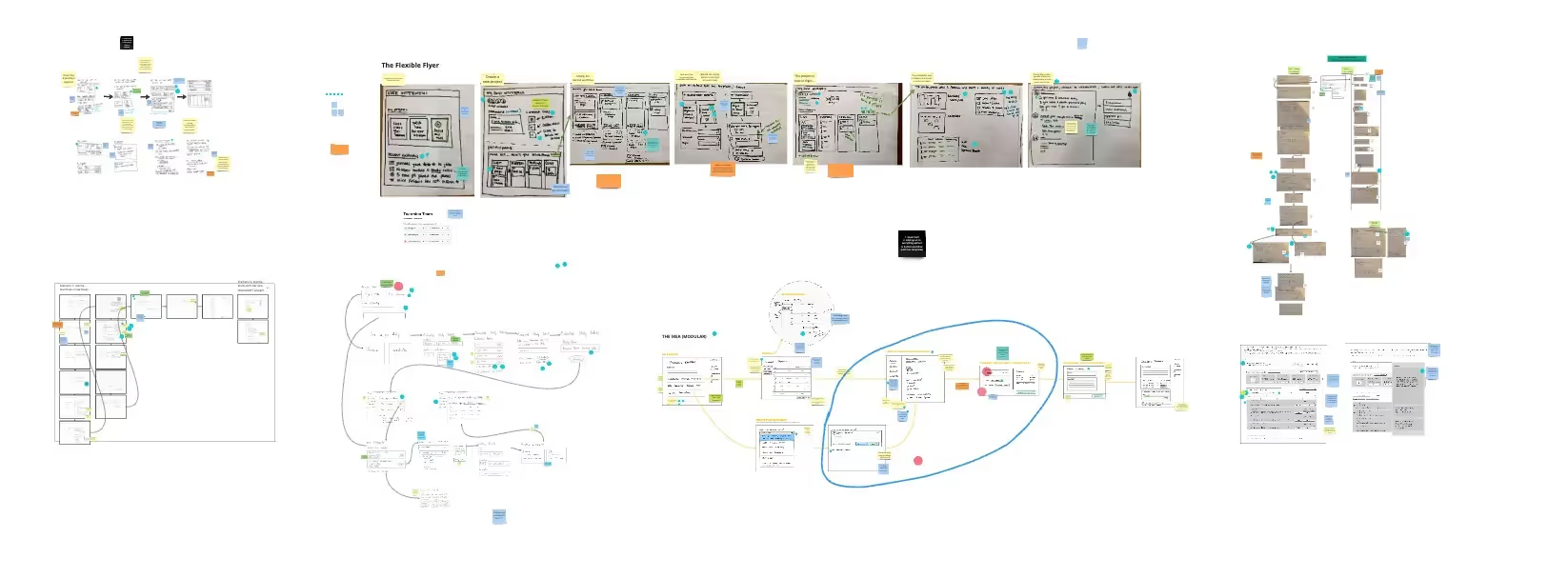
Our first prototypes were rough, but were an excellent way to collect initial feedback on what was resonating. Here’s an example prototype that came out of our sprint.
All of this work—the foundational research, ideation work, and evaluative testing with our customers—gave us confidence in many of the ideas we were considering (of course we threw out a lot of ideas along the way too) and helped us sequence an upcoming roadmap.
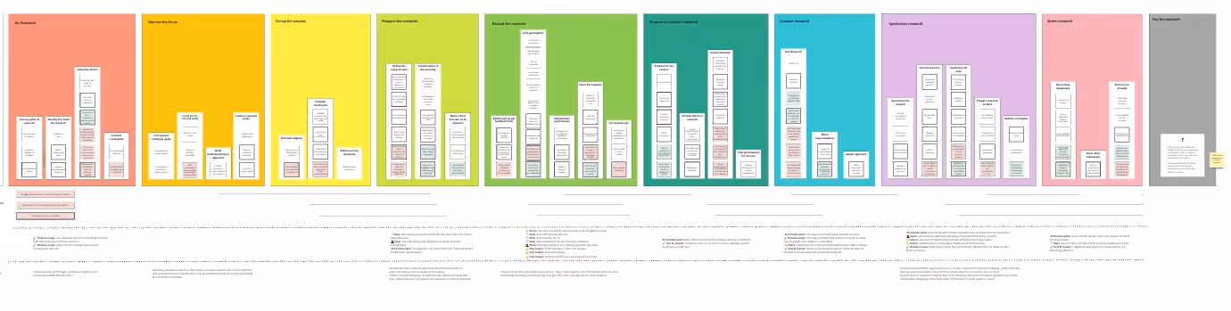
Our first step was to revamp the information architecture. We conducted several rounds of research with user researchers, product managers, designers, and customer service managers, each with varying levels of experience. Our system needed to work for new and seasoned researchers across the organization.
Understanding the research lifecycle and its many components
The key to an intuitive experience is being able to interact with or navigate a system with minimal friction. For us, that meant we first had to understand the relationships between distinct activities within a research project.
We ran an unmoderated card sort with 20 participants, where each participant was given a list of research tasks. The first task was to group items they thought belonged together, name that group, and then explain their rationale. The second task was to compare their groupings and names with the ones we created ourselves during our sprint.
The card sort revealed:
- The most popular groupings followed the chronological order of a research lifecycle. "I sorted the components into 4 groups that mirror what I believe to be a logical "order of operations" for setting up and managing the project...”
- There was a good deal of overlap in how we and our participants grouped tasks.
- There were a few tasks that lacked clear consensus—while an overall pattern was emerging, each research practice differed slightly.
"Orgs may bucket the tasks differently depending on their own operations."
This presented for us a challenge—where do we put the tasks that lacked agreement in the study?
Translating our card sort into a coherent navigation
Taking those learnings, we moved on to run moderated concept tests where we showed participants early wireframes of the navigation. Initially, we showed participants just the navigation items with no content, probing them on what they might expect to see under each item. The goal was to understand which structure resonated the most, and validate our findings from the card sort.
Here were some of the iterations that we tested, our hypothesis, and where we ultimately landed.
Flat
One of our goals was to increase flexibility in the new experience. We took the groupings from the previous tests and converted them verbatim into navigation elements.
This didn’t work because it was too flexible and made it seem like the setup process could start from whichever tab. In actuality, there was an intended sequence—selecting certain options upfront would reveal other options in subsequent tabs. This version also placed too much emphasis on the “setting up” phase of the research project and incorrectly represents the research lifecycle.
Layered
In our next iteration, we wanted to create more structure and balance between the two main phases of the research lifecycle.
This didn’t work because it gave the left sub-navigation too much prominence and created distraction in the workflow. Participants preferred more focus given to the tasks that were strictly required.
Layered tabs
This last version highlights the two main research phases in the navigation and shows the tasks associated with each phase below. This ended up being the design that resonated most. Participants felt that it wasn’t too intrusive, and made it clear exactly where they were in the process. They also liked that it felt familiar to other software they frequently use, and noted that the primary navigation mirrored their research workflow.
“When I'm working day to day I am very much in one of those two phases. I'm only in one of those two at any given time, so I can just go directly to that spot.”
Guiding principles that informed the overall design
While we were considering information architecture, we also reviewed customer feedback and saw a lot of opportunities to improve core parts of the project workflow. We used the following themes to guide us as we iterated on the winning design:
- Speed and focus: Users need to make a lot of decisions in the project creation process, but we were presenting those decisions in a way that wasn’t always clear, especially to less experienced researchers.
- Non-linear progress: We wanted to allow flexibility in the project's progression, avoiding rigid and linear approaches that aren’t realistic for how research gets done.
- Collaboration: Projects often require multiple stakeholders to be involved. We wanted to bring collaboration to project drafts, where many of the decisions around recruitment, setting up schedules, and choosing incentives were being made.
- Participant experience: People doing research with their own customers want a better understanding of their customers’ experience throughout the research process.
- Self-serve changes: Researchers learn as they go, and they need to edit and update project requirements accordingly.
Bringing these design principles to life
We’ve made a number of changes to the core workflow based on these principles. Here are a few examples:
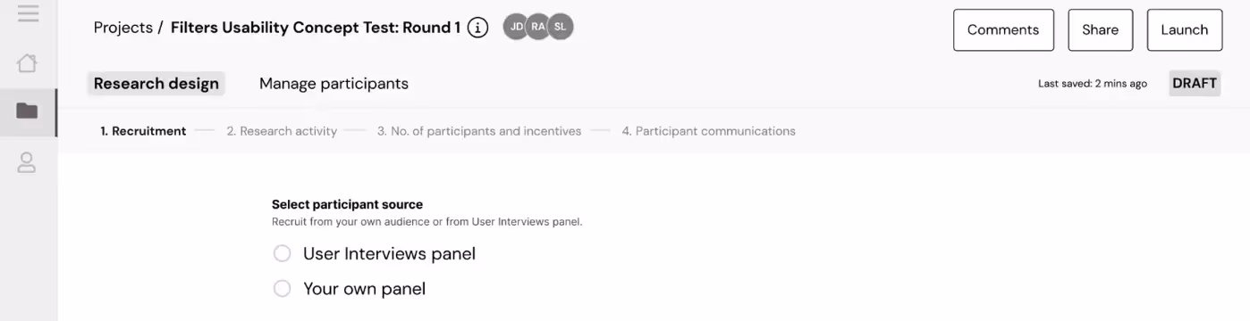
Highlight progress with steps
We tweaked our progress bar design so researchers are quickly able to tell how far along they are in each section.

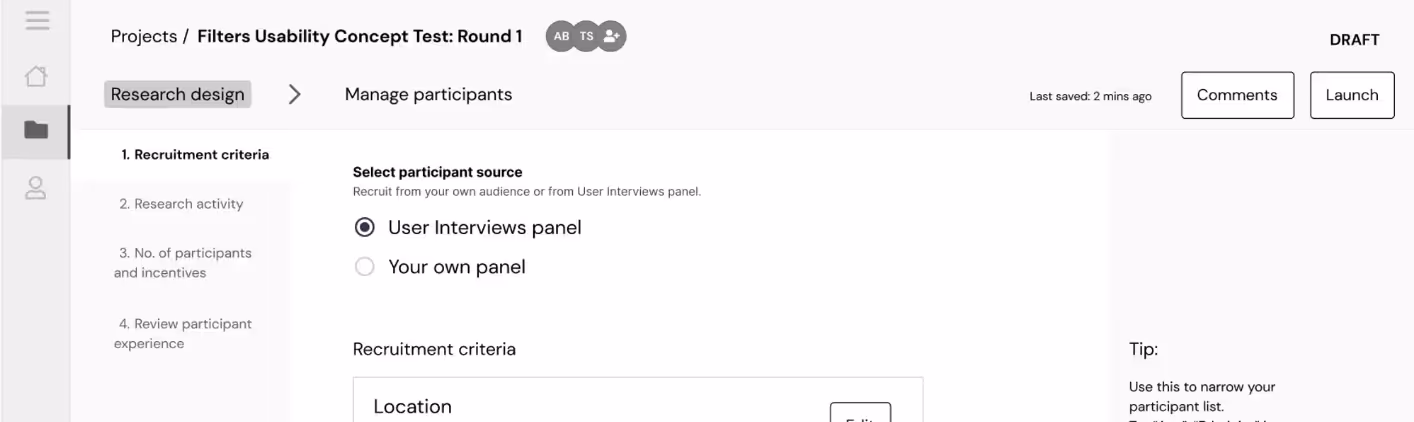
Reduce cognitive load by collapsing options
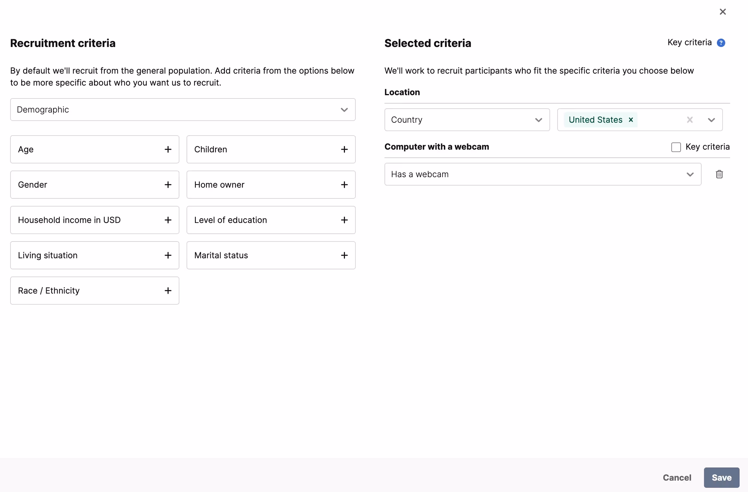
In the previous version of our app (below), we dedicated a whole page for selecting recruitment criteria, displaying every possible option at once. This is a lot of information to navigate, especially for a less experienced researcher. Our product data also showed that most recruits only use up to 7 criteria.
We explored making this step simpler and less overwhelming by using expand/collapse patterns and a multi-step selection process.
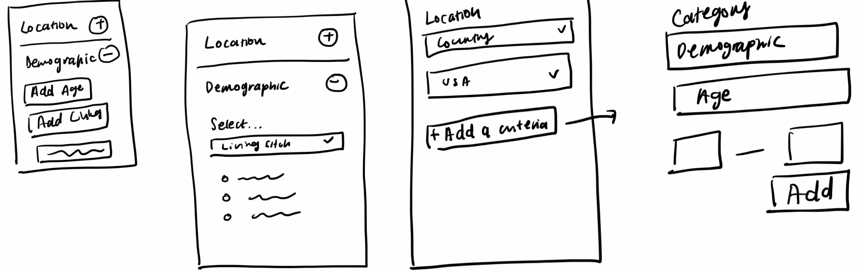
We arrived at this 2-panel pattern that gives users a clear view of what criteria is available, and which selections they have made.
Preview the participant experience
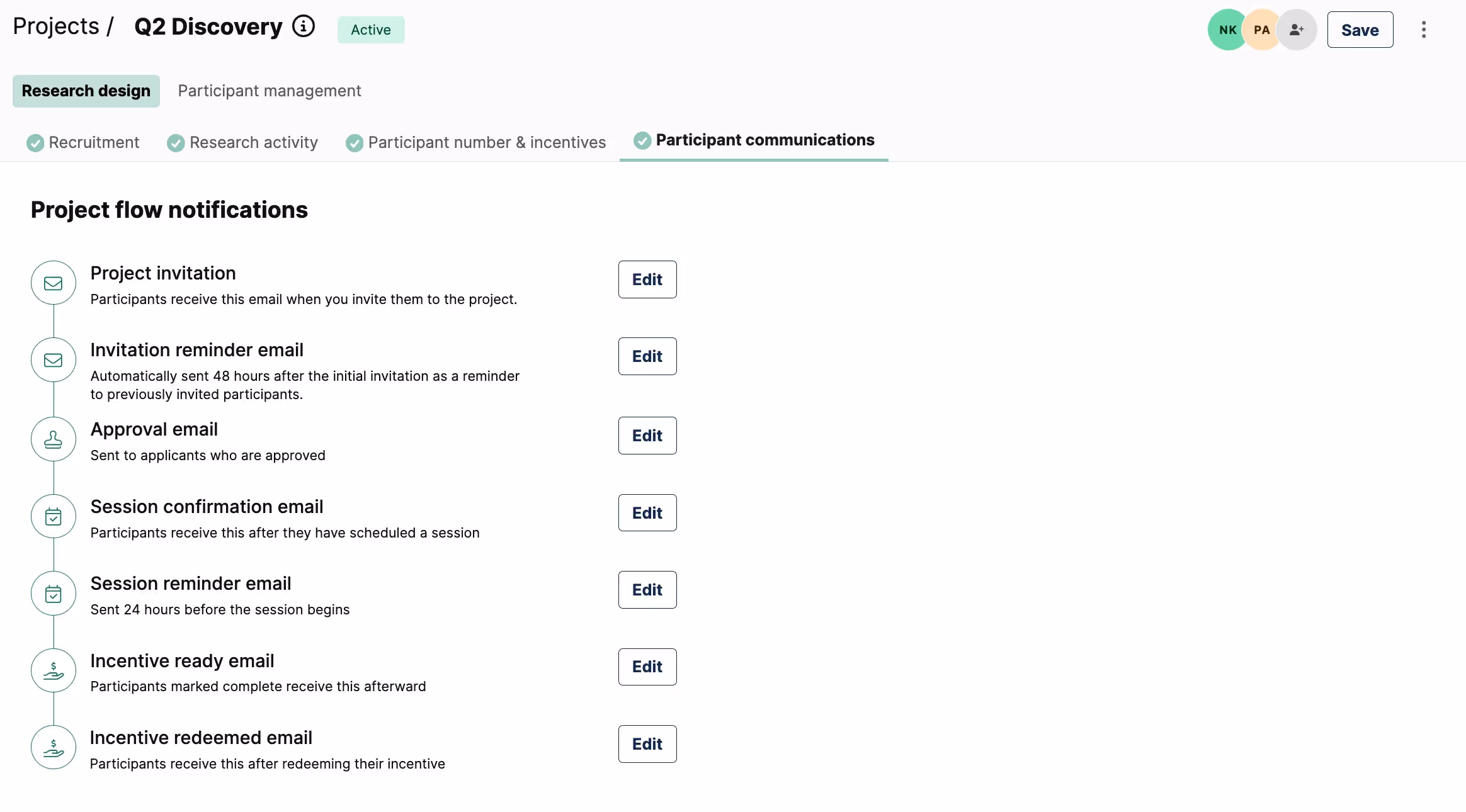
We know that many researchers test the participant workflow themselves to ensure a positive and professional experience for their participants. To instill more confidence, we added the ability to edit and preview all participant communication to the setup phase, so that every touchpoint can be tested and confirmed before launch.
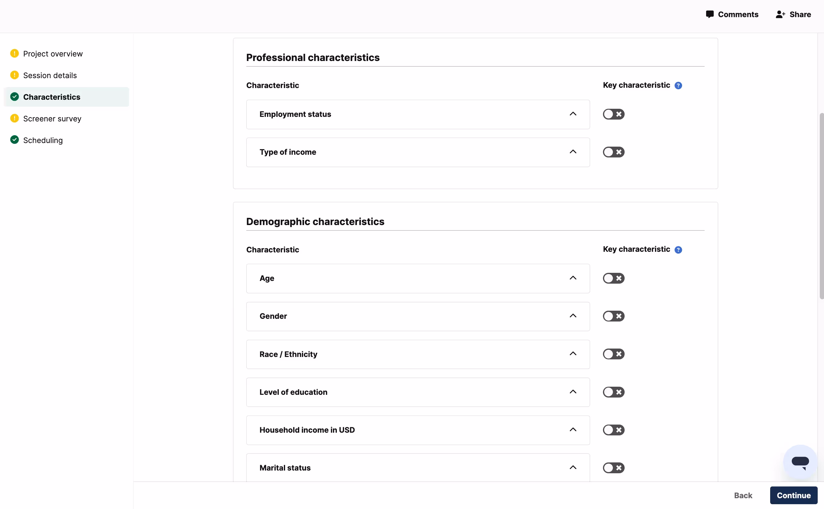
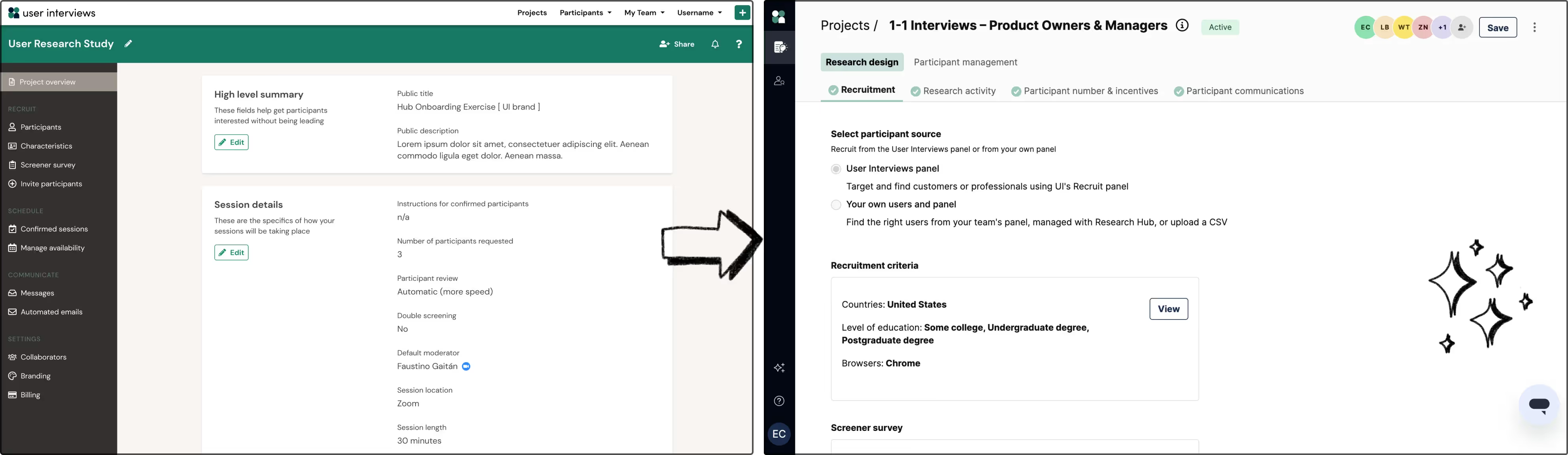
Switch between high-level overview and in-depth drill down
There are a lot of requirements that go into a research project. The challenge is to present these requirements in a succinct manner, whilst also allowing users to drill down or edit their requirements. We used summary components to highlight the user’s selections, with a button to view and edit the nitty-gritty details in an expandable drawer.

Gaining confidence in the redesigned experience
Since this is such a significant change, we wanted to gain more confidence in the overall flow via unmoderated testing with a larger group. We gave 40 participants a research brief and asked them to create a project with the prototype. They were able to complete most tasks easily, but had confusion around some of the language that was used. We also saw that some participants found it tricky to find some tasks that were relevant throughout the research lifecycle (like scheduling and changing moderators). We iterated to simplify the language, and to make those tasks more easily discoverable.
Learning from our beta community
We launched a beta of the new workspace in December 2023, and then expanded early access to our customers in the new year. As a company who believes in research, we (of course!) tested out the new experience ourselves, and have been using it to run research with our customers for the last few months.
We gained so much valuable feedback from these early users that greatly influenced the design of the final product. To all our beta testers and early adopters—thank you, we couldn't have done it without you! The new project workspace is now LIVE for all User Interviews customers, and we’re so excited to keep building upon it in 2024 and beyond!