A little prologue if I may… this has been my favorite thing to work on in my career. Has it gone perfectly? No. Did I make mistakes? Yes. Will it be successful? We’ll see… [Erin, VP of marketing here. Yes, of course it will be! 😅]
But it’s the closest I’ve ever been to users throughout researching, designing, and building a solution. And not just any users — UX, research, and product professionals from world-class organizations who were super engaged whenever we asked for input.
Plus, I got to build a tool for myself that I use all the time now. You’re not your user? HA!
Lastly, I did it all alongside an awesome team where we supported and challenged each other constantly.
Here’s the story of how we got here. To our big launch of Research Hub.
What should we build next?
The debate around how to determine what to build for your customers to meet their needs is a lively one. One school of thought is that you cannot simply ask your customers what they want because they don’t know (faster horses, anyone?). Others are more open to considering input from their users.
Regardless of your organization’s philosophical bent, if your customers are actively bringing the same idea to your doorstep over and over, you’d be wise to listen. This was the situation we found ourselves in a few months ago.
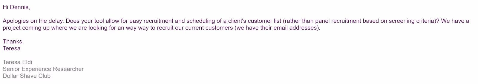
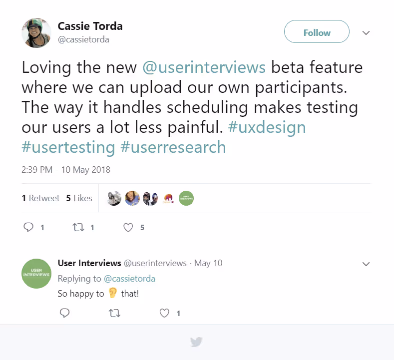
We’re in the business of recruiting targeted participants for user research, so we’re pretty accustomed to questions like “are you able to recruit x,y,z type of participants?” (Yes, btw 😉). But we started noticing a trend of researchers asking us if we could handle all the recruiting and logistics when they need to talk to their own users. See for yourself:

This was an exciting development for a number of reasons.
First, we genuinely care about our researchers and here they were with a pain point that we were well positioned to solve! And sure, selfishly, we had this exact same problem ourselves and didn’t mind the idea of building a tool to make our lives easier, too.
Second, we know different types of research require talking to different types of users. Prospective users, our bread and butter at User Interviews, are great, but sometimes talking to existing users is even better (imagine you’re redesigning a core workflow in your app – kind of important to hear from users who rely on that workflow).
If we can make it easier for researchers to do both in a single place then we’re reducing friction and making it easier to talk to the right users at the right time, all from one place.
Everyone should do more research. Talking to people, learning things – it’s the best (provided you’re not getting bogged down with tedious logistics, of course 😜).
Anyway, we were excited. But thankfully we didn’t get totally ahead of ourselves.
✨ Learn how the UI research team uses Research Hub!
Wait, so what exactly do they need?
How’d we answer this? C’mon, we talked to our users. Well, technically, we surveyed our users first.
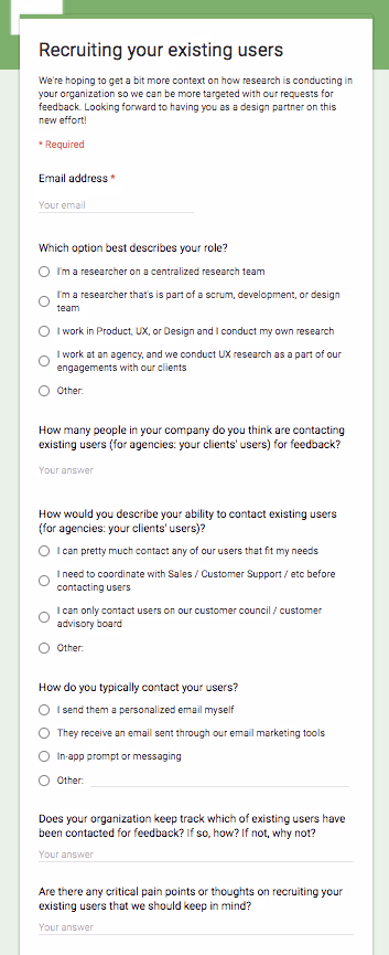
We emailed a group of our more active customers and framed filling out this survey as “becoming a design partner” on the solution. This was intentional as we wanted to view these responses as high intent. We figured if they care about this problem enough to volunteer to help us solve it, then that’s a strong signal.
We had 44 design partners almost overnight.
This was great because it covered a lot of vectors where we thought the right solution to this problem might deviate. Are you the only researcher at a company or part of a large research team? Do you work for a large company or smaller company? Are you restricted about contacting your users for feedback? Etc. It seemed like any number of things could impact how you go about engaging with your own users for feedback and we had our bases covered.
From there, we tossed together an interview outline of questions (check it out here if you’re curious). The goal of these conversations was 100% discovery. How are people solving this problem currently and what are their biggest pain points?
We spoke to 12 users during this initially discovery phase and a few clear themes emerged.
Themes
1. Researchers are clever.
We heard about a wide variety of homegrown solutions for recruiting their existing users. MacGyver would be proud. Allow me to paraphrase a bit…
“We use this tool to contact them but survey them through another tool, manually vet responses, and use this scheduling tool for the people we like. Incentives? That’s always kind of a mess.”
These solutions, of course, were never perfect and everyone had a complaint about some part of it. But this showed that recruiting their existing users was important enough that they weren’t waiting around for a solution. They were out there creating solutions. It also taught us a ton about the nuances that people care about. It was like having dozens of MVPs already in market to learn from 😍. Some researchers even went as far as screen sharing with us to really show how it worked or mock recruiting us through their process and tools.
Yea, I know — our users are the best.
2. Researchers are also empathetic.
No surprise here, but it came through loud and clear how much they care about their user’s experience even when recruiting them. They were often asking us just as many questions as we were asking them.
- “How will this be branded? Will it say User Interview or have my company’s info?”
- “Do my users have to make an account on your site or can they just submit their info?”
- “What’s the experience like for users who apply to participate but don’t get selected for a spot? How do I let them know what’s going on?”
And so on. I’ll say it again — our users are the best. We’re legit spoiled.
3. Tracking and coordinating who you’re contacting is a nightmare. For everyone.
Even if you’re the only researcher in a small organization, tracking when you last contacted someone for feedback... and when they last responded... and when they last actually participated... and so on is a ton of work.
This was a huge light bulb moment for us.
Just a quick sidebar here — obviously I know and believe user research is hugely valuable. It is literally what I do for a living. That said, it still feels nice to occasionally get clobbered over the head with an insight and have an “ah ha!” moment. This was one of those. We all need a little reinforcement now and again.
Ok, where was I?
Hearing stories over and over again of spreadsheets that fall out of date, or systems that don’t talk to one another, or simply not having the time to do it was eye opening. People who had a system for tracking either hated it or admitted it wasn’t totally accurate. Others didn’t even bother pretending to track this information (this is sneaky my favorite group – skip the bullshit 👊).
Let me explain why this was a significant insight. Up until this point, we had really only been thinking of the solution as one-off, on demand type thing. You need to talk to users for feedback on something, and here is a tool that makes the process easier. Now we had discovered there was a lot of value in also helping organizations connect the dots between studies and make sure they are not over contacting the same users. Better yet, our solution was naturally well positioned to do this exact thing.
Ok, let’s build everything!!!
Alright, that wasn’t our exact thought process but our enthusiasm combined with all of our new insights did cause us to get a little carried away. We started sketching and kept sketching and then sketched some more.
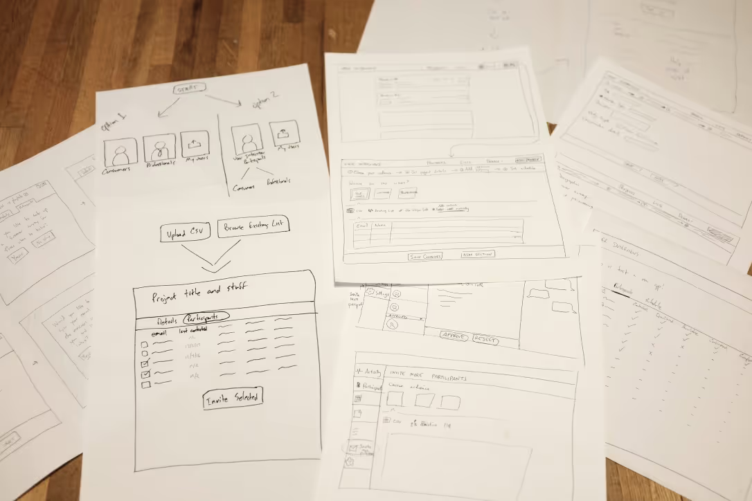
So far, so good. This is a fun part of the process after all. But like most fun things in life, they can also be a little dangerous and you can get yourself into trouble if you’re not paying attention.
If I’m being honest (I am), we made a few mistakes during this phase of things.
The biggest one we made was the most obvious. We started trying to fix everything. You know, only like the cardinal sin of product development. No big deal.

To be fair, the feedback and insights we collected about how researchers recruit their existing users really did touch on the entire recruitment process, which is what our product does. So all of these tangential ideas and proposals weren’t really even all that tangential (uh oh, I’m justifying it again…).
Tl;dr — we lost our focus for a bit.
Then we caught ourselves, shelved a bunch of awesome ideas that we will revisit later, and got back to the task of making it possible for researchers to use our tools to recruit their users.
Pricing - Let’s talk about Pricing
Another area that proved irresistible to us early on was pricing 💸. This actually wasn’t some profit driven obsession. It was a matter of our current business model not feeling right for this new solution. I know that sounds squishy and emotional for a quantitative and scientific thing like pricing but hear me out.
We charge a flat recruitment fee per participant that we recruit for a researcher from our audience. This can be framed different ways but it is largely a sourcing fee. It didn’t make a ton of sense to us to charge researchers the same way when they are recruiting their own users.
It was an itch we couldn’t stop scratching. On the whole, this wasn’t unproductive or entirely misguided. The mistake was that we spent too much time on it, too early in the process. If I could do it over again, I would have waited until the solution was better defined before getting into pricing. Now, even with this knowledge, in an alternate reality do-over, would I actually have the willpower to delay these conversations? Unclear.
Process Mitigates Time Lost
The good news is that we hedged our bets such that these mistakes didn’t cost us much. How? Sequencing. How you stagger and parallelize things is really important in product development. I think sometimes people are hesitant to discuss it because it can sound a little “waterfall-y” on the surface. And doing anything that can be seen as sympathetic or supportive towards waterfall development processes, gets you kicked out of the cool kid club these days. Or does it?
Don’t let that scare you, thinking about how the various pieces will come together with your team is a valuable exercise.
In our case, we knew all along that storing another organization’s user data in our system was going to mean we had to absolutely nail security and privacy. There was no question about the importance of this area. The architecture investments to do that did not have a lot of dependency on the workflow or UI choices we were debating so we put the development team to work. This gave them a little more breathing room to make sure the User Interviews audience of participants and any organization’s population of users were totally separate and isolated.
And it gave the rest of us a little breathing room to recover from the aforementioned mistakes we were busy making 😬.
The developers got started on the infrastructure. The rest of us ironed out the remaining details to make a credible prototype and started getting feedback.
We ended up having 26 sessions where we showed researchers some iteration of the prototype we kept evolving, day to day, week to week.
Suffice it to say, the prototype changed a lot from the original version and we learned a ton. I won’t bore you with all the details. Here are a couple of the highlights.
Some things we learned in validation testing
1. Screeners — not always required
Researchers have other means of targeting and qualifying their own users for a given study so collecting additional contextual data can sometimes be a hindrance rather than a plus. Not much else to say on this one. Makes sense.
2. One thumbs up for tracking “activity stats” on users; two thumbs up for tracking those stats in an intuitive format
We took our best guess at what “activity stats” would be helpful to track — last invited, last applied, last participated — and that guess was quickly validated. A fun, small detail that we learned was providing the data in an “X days since” format was more useful to researchers than providing the date itself. It better fit their mental model of suppression rules (i.e. “I don’t want to invite anyone who has been invited within the last 30 days”) and saves them from doing annoying “date math” (the User Interviews team can attest – “date math” is a serious pet peeve of mine).
3. Organizing their users is important, but flexibility and simplicity rule
Our very earliest prototype included the notion of organizing users onto specific “panels.” This paradigm was inspired by “customer counsels” or “customer advisory boards” researchers had referenced in the discovery conversations. Conceptually, “panels” resonated but lots questioned followed. “Can the same user be on two panels? How do their activity stats get tracked in that case?” In comparison, a flexible approach that allowed researchers to apply labels, create custom attributes, filter on attributes and labels, then save these filters to build any kind of list did not generate these type of questions and handled a wider variety of use cases. Perfect.
4. Providing paths for their users to “opt in” to providing feedback outside of a study is valuable… but hard to solve.
Researchers loved the idea of giving their users a persistent way to “opt in” to providing feedback and knowing who had explicitly opted in. We tried to crack the case on this one. We really tried. But there wasn’t a single approach that fit the different use cases for different researchers. Custom landing pages, embeddable forms, on-site intercepts, etc. We will definitely come back to this topic but it was beyond the scope of a v1 effort.
Should we ship it? We should ship it.
As the solution was coming together, we planned to do a lot of internal dogfooding of early versions as soon as we could. Remember, this is a problem we have too! There were SO MANY TIMES when we were trying to get feedback on this solution where we wished the solution already existed so we could use it to schedule these very feedback sessions. Heady stuff.
But the more we thought about this the more we realized we should open it up to our users too. After all, shipping things before you’re totally comfortable is how you accelerate learning. And our users cared enough about this problem to spend a lot of time with us giving their input throughout the process.
We slapped some duct tape on what we had built so far and opened up a beta for anyone interested.
What did the beta look like on day 1?
It consisted of a functional but limited project builder that lacked some of our normal tools. We had a CSV importer tool that could only accept email, first name, and last name as fields. It also sometimes did not parse the file correctly and failed silently. There was not yet any concept of tracking which users had been contacted across a company. Plus plenty of other small hacks that we jammed in behind the scenes during the final few days of testing.
I think this is, hands down, the best decision we made throughout the entire process. It was also, by far, the most intimidating. Any time you build something, you know where all of the little flaws lie and you wish you could fix them all before anyone else uses it. But that’s a fool’s errand. No product is perfect or ever really can be. We all know this on an intellectual level.
Emotionally? It’s a little different. Shipping a barely functional version of a product to a group of UX, research, and product professionals—aka my peers who I respect deeply—was scary. Like really, truly, legitimately scary.
Like most things in life when you decide to set your fears aside, it turned out to be amazing. No, things did not go perfectly. But we got questions, suggestions, and bugs pointed out to us regularly. Internally, it gave us a renewed energy and sense of urgency. We even had some people who — *gasp* — told us how much the beta was already helping them and saving them time.
Look at some of the unsolicited feedback we received.
“We just finished a round of user interviews and enjoyed the experience. I definitely plan to use your service again.”
- Shafiq Shariff, VP Product, Pangea Money Transfer
“We really like being able to upload our own customers as participants - this has proven to be super successful for us, and really easy to use.”
- Brandie Smith, Senior User Researcher, Metromile
We also learned a lot.
Here’s an example—we didn’t bother setting up our usual messaging tools for these private projects because a) we assumed they wanted to own the communication channels with their users and b) it is slightly more complicated because their users do not have User Interviews accounts.
Well, it turns out that people want to be able to message their users through our tools. Fair enough. We are in the process of adding that functionality.
Another small thing we missed — requiring a monetary incentive payment. This is kind of an embarrassing one because it affects our own usage of the tool… we often offer our researchers free participant credits to use on future projects as a thank you for speaking with us. And yet, somehow, we didn’t account for this upfront 🤦. Don’t worry, we’re busy fixing this too.
Categorically, we learned the most about how researchers wanted a centralized participant database of their users to work. As noted above, this functionality did not exist at all on day one of the beta. As users launched private projects during the beta and uploaded their users into our system, they developed stronger points of view on how the participant database should work based on real world use cases. So we made it possible to bulk apply labels to users while importing a CSV, set up the ability to add custom fields of data on users, and built out robust filtering tools. All of these things came directly from user feedback.
Relatedly, we discovered that a lot of researchers wanted to import large lists of users upfront, outside the context of a specific project. We introduced the ability to upload a CSV directly to their participant database and beefed up our architecture to support much, much larger imports.
Lastly, we were able to better understand concerns around privacy and data security. Something as seemingly simple as being able to delete a user was a huge win to alleviate concerns here, and came from beta user feedback. Clearly a researcher should be able to remove a user from our system. That’s a no brainer.
But what if that user had previously participated on a project? How did the researcher expect to see that record when they went back to the project after deleting the user? Well, we found out and now that use case is covered.
Going through rounds of penetration testing and other technical security review measures were valuable for the new feature set as well. Always nice to learn your app can meet the standards of a corporate IT security team during a beta release.
So that’s pretty much everything, but we’re not done.
Today is a big milestone for us. ✅
Launch days are fun. They are also the first step of a longer journey. Or, I guess, technically the second step if you already had a beta? 🤔
As I mentioned earlier, we had a lot of other ideas we’d like to get to after talking so extensively to our users. So the plan is very much to continue talking to users, continue iterating on the solution, and continue to solve our users’ problems (as they relate to user research, at least).
Learn more about Research Hub + Give us feedback
If you’d like the more focused, concrete explanation of what we’re actually launching then I’d encourage your to check out my colleague’s post.
If you want to sign up for a free 2-week trial, you can do that here.
If you’d like to sign up to give us feedback on Research Hub or future products, sign up here.
If you’d like to become my best friend then send me your thoughts or feedback on our app or user research in general, email me at jh@userinterviews.com whenever. ✌️
If you'd like to contribute to User Interviews content, check out our guidelines here.