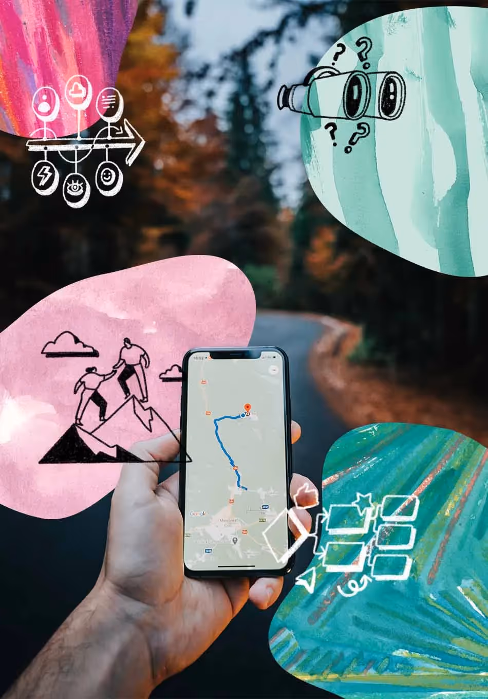
Qualitative UX research data from user interviews, usability studies, incoming user feedback, and other sources usually consist of a lot of notes, recordings, transcripts, and other unstructured information.
But how do you make sense of what you’ve gathered? Better still, maximizing the richness of these data but without missing deadlines?
Affinity mapping is one way to approach the synthesis of qualitative data. In this article, we’ll cover the basics of affinity mapping and you’ll learn 5 concrete steps to conduct affinity mapping successfully.
What is affinity mapping?
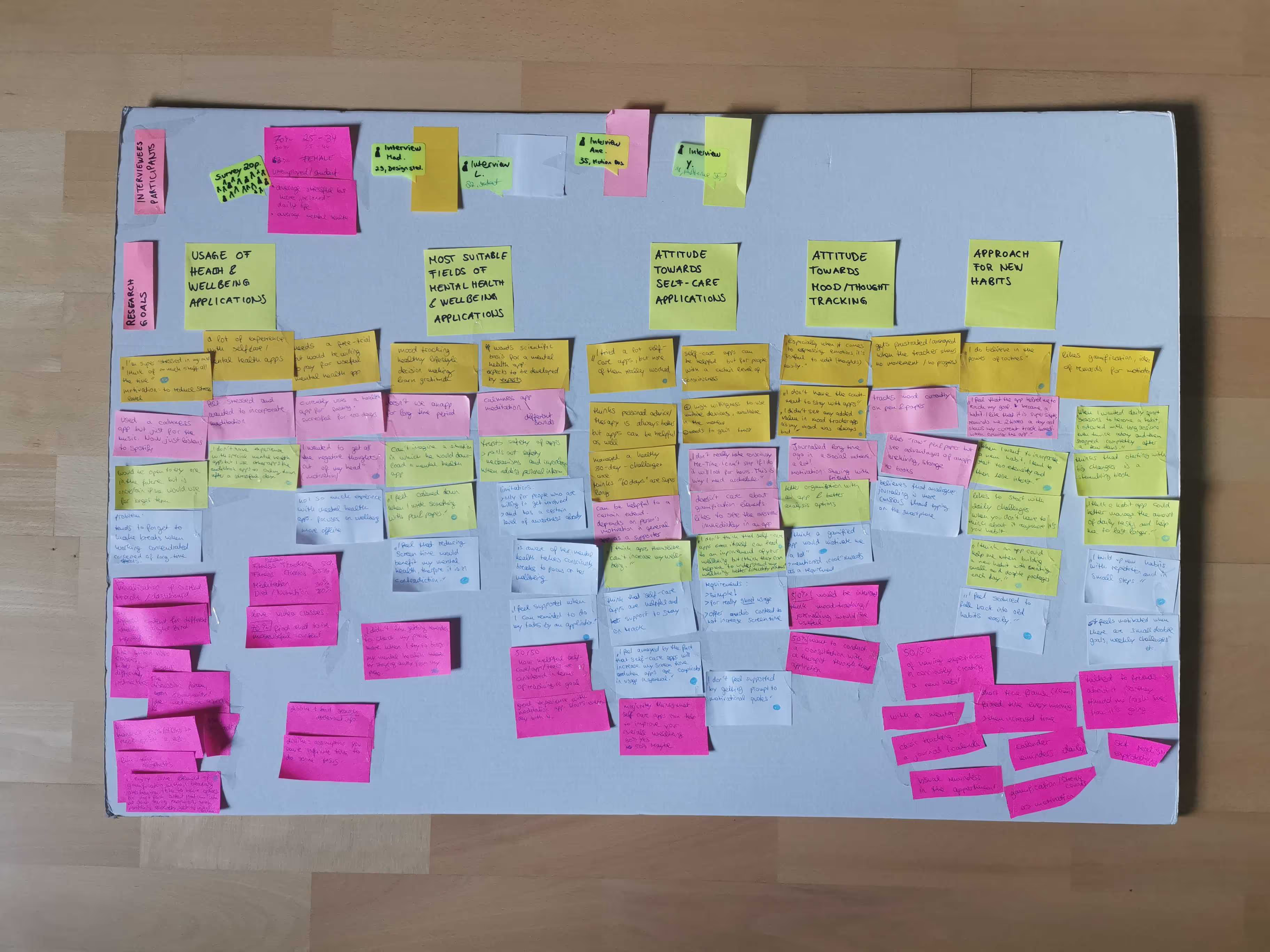
Affinity mapping—or affinity diagramming—is a synthesis technique in which you thematically analyze the data from qualitative research and organize everything in a way that allows you to better understand the information.
In other words, affinity mapping in UX research describes the process of categorizing and sorting all qualitative research data based on similarities (or ‘affinities’). The output is an affinity diagram, a visually sorted and labeled wall of research data, which is why this method is sometimes also called affinity diagramming. It’s a common technique for user research analysis.
Affinity mapping helps you extract actionable insights and distill patterns from what you’ve collected during research.
Often, this consists of a lot of qualitative data in various formats that can appear daunting when entering the analysis phase of a research project. Affinity mapping is a technique to manage this amount of qualitative data and draw valuable conclusions from it. In addition, it’s advantageous for dodging the tendency to prioritize data points that you’ve been expecting (confirmation bias) or that you have collected most recently (recency bias).
Read more about research analysis in our UX Research Field Guide.
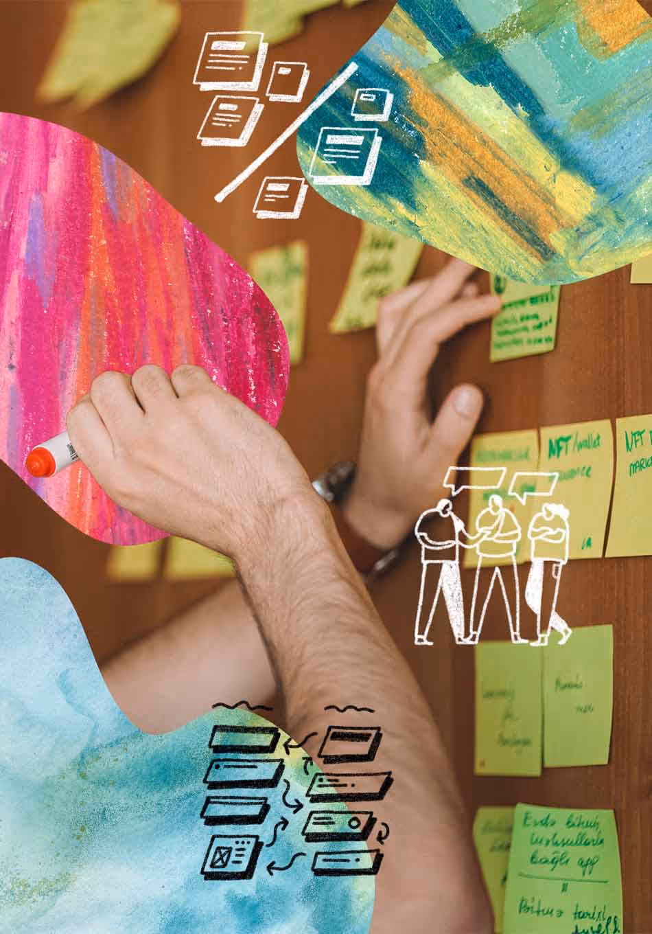
Affinity mapping as a team
Affinity mapping is an excellent way to collaborate with your team and helps bring everyone closer to the user. But how do you manage this technique with a team?
A practical approach for affinity mapping as a team is to start by collectively assigning themes for the first session, then splitting up and continuing in smaller groups and coming back together to build clusters jointly. Make sure to set a leader for this task to help the team through this process.
Inviting stakeholders in the research process for affinity mapping can be a valuable way to engage them in user research findings, build a collective understanding of user research and open the doors for discussion around what you’ve found.
5 steps for successful affinity mapping
Step 1: Prepare the data for affinity mapping.
Before affinity mapping, you must bring all gathered information together on movable notes.
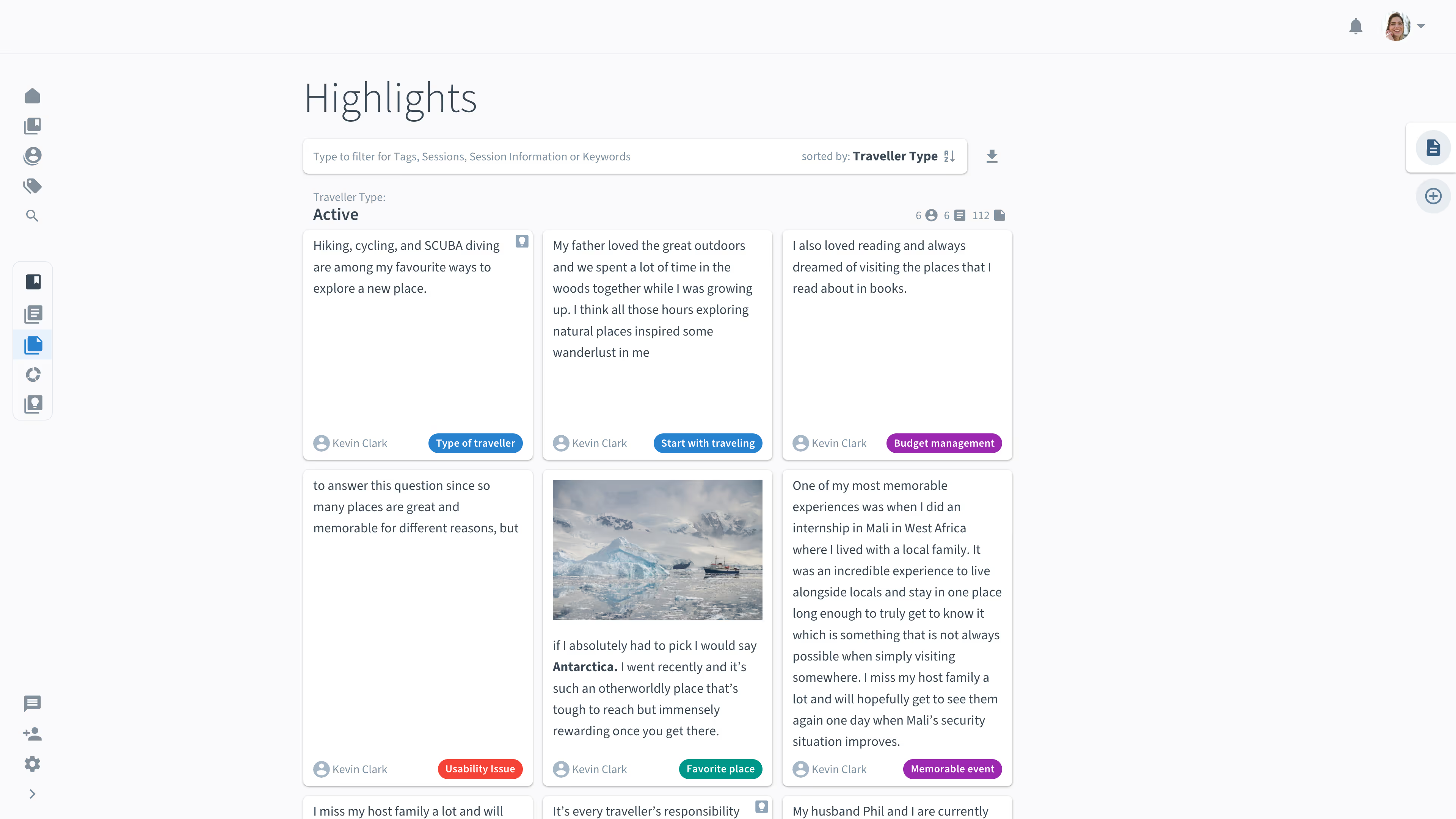
Therefore, get the single observations, statements, etc., to individual notes. These can be either physical sticky notes or digital notes. For digital notes, more general digital whiteboard tools like Miro or dedicated user research tools enabling streamlined collaborative affinity mapping like Condens can support you.
Make sure not to restrict or consolidate the data too much in this step. However, it’s a balancing act. The more notes you have, the more time is required for analysis.
It’s helpful to highlight interesting phrases in the first step, either with a pen or digital tags. The complete set of tags is often referred to as the taxonomy to organize all tags. With digital tools, this step works by assigning themes (often called tags, codes, or labels) to the different sections within your interview transcripts, observation notes, or user feedback.
For analyzing user interviews, a good starting point is the set of topics covered in your interviews. For example, when participants describe how they compared different transportation options for their last travel destination, you could label this section as “Comparing transportations.”
This is the first step in categorizing your data. Still, it also helps you to decide where to split your collected data into more manageable chunks based on thematic similarities. You can use spreadsheets or dedicated user research tools like Condens for tagging interesting research highlights.
Learn more about "coding" qualitative research data.
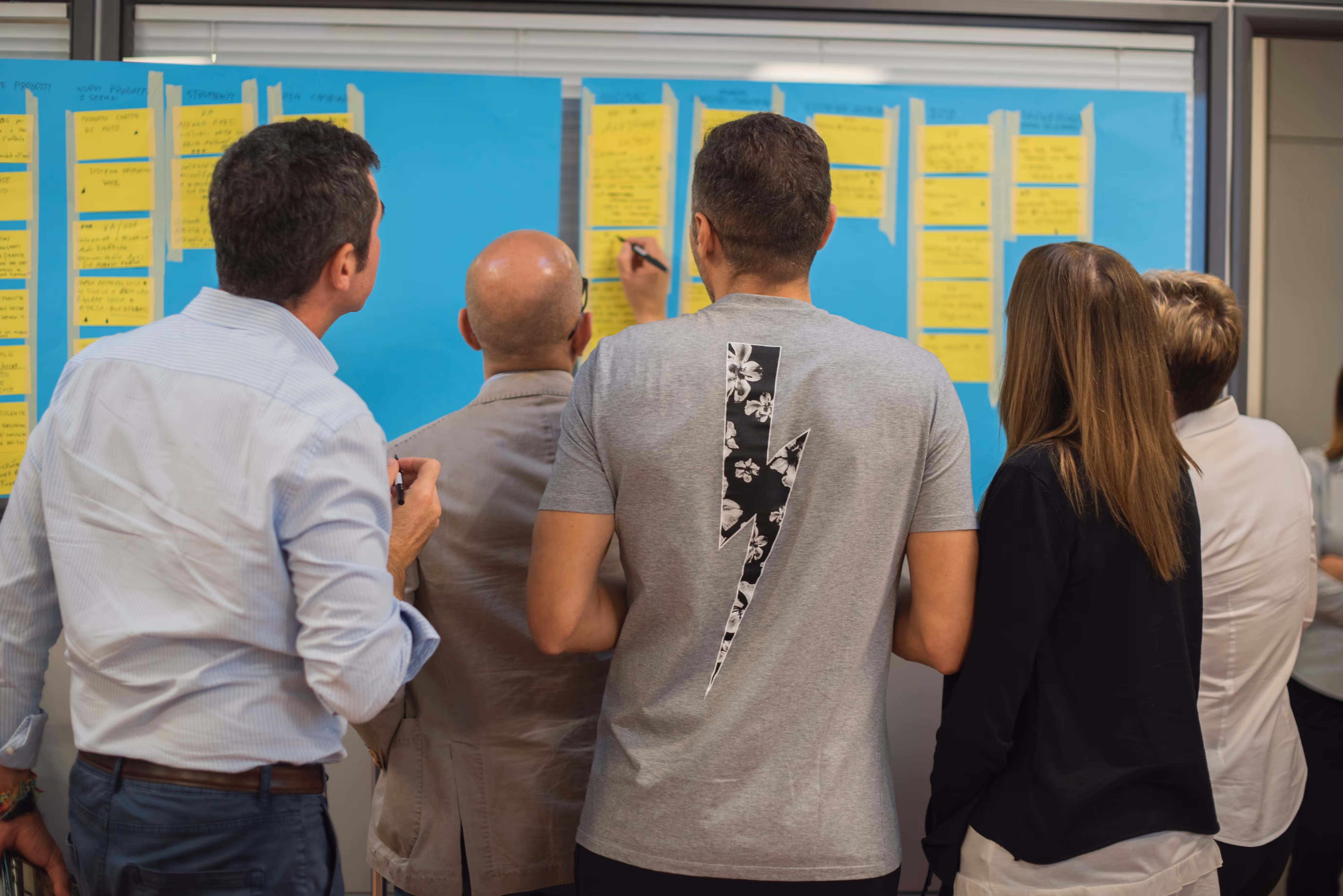
Step 2: Create clusters.
After organizing all observations, statements, and highlights on notes, you can now start to build clusters to dive one level deeper into the research data. When you’ve assigned themes to your research data, you can start with one theme and then move through the other themes.
Get started by picking the first note and creating the first cluster with it, meaning, you place it on your (digital) wall where the affinity mapping will happen. Pick the next one and check if it is related to the first note and if you find a relevant commonality. Then, either group them or open a new cluster with the note.
There’s no right or wrong with what you define as the commonality of the group. However, it’s always a good idea to start by grouping commonalities around the topic of your research questions.
Pay attention to emerging themes and the need to split up grouped clusters to discover patterns in your research data. Then, whenever you find something, document this pattern and name the clusters to keep track of what you’ve found so far. Go through the entire stack following this approach.
💡Tip: At the end of affinity mapping, you can also turn the cluster names into short summaries of what you’ve learned with that cluster which can be shared as a key insight with the team.
Step 3: Repeat the process.
Affinity mapping aims to uncover underlying patterns in your qualitative research data. And sometimes, the trick lies in repeating the process a few times.
Keep what you’ve mapped so far, and start over again by picking the first note and opening a new cluster. This approach allows you to recognize different patterns in the data and clarify first recognized structures.
As it is not a rigid process, you may need to start over with a newly discovered theme. This is part of the process, so don’t hesitate to change the order anytime, reorder notes, add onto existing clusters from any round of affinity mapping and sometimes wholly start over. When using post-its on a wall, you may want to take a picture of the first round or copy the notes for another round.
Step 4: Include contextual information.
Another proper technique to reveal underlying patterns in your qualitative research data is to split up participant responses based on contextual information, like the participant's age, professional role, or location. This metadata information can be key to discovering hidden patterns in your research data and bringing your insights to another level.
For this step, dedicated user research tools can help you quickly sort and filter by participant or research session information to enable you to look at the research data from new perspectives.
Step 5: Zoom out and analyze the relationship between clusters.
When having a (digital) wall full of clusters around affinities in the research data, try to look at the picture further away. It’s a good idea to zoom out at the end of the process to see how the different clusters relate to each other and allow cross-cluster analysis.
You can think of this step as further sorting, but now with whole clusters to see which are more important to others and which have dependencies or order. Don’t hesitate to segment the clusters or draw connections between coherent clusters.
Wrap up
Affinity mapping helps you to categorize and sort qualitative UX research data, find patterns in the gathered information and draw conclusions.
As the last step for successful affinity mapping, it’s crucial to convert the findings into output. The best form of this output depends on your research questions but could be a “Jobs to Be Done” list, a prioritized list of pain points, or an evidence-based user journey map, for example.
It’s always a good idea to share the research outcome along with an engaging presentation on the user research findings to really make them stick with your audience.
Further Resources