.avif)
The annual UX Research Tools Map—the only illustrated guide to the user research software landscape—is now available.
Go check it out and, when you’re sufficiently impressed, come on back to read about the history and methodology behind the map.
EXPLORE THE 2024 UX RESEARCH TOOLS MAP
In this article, you’ll find:
- The story behind the first Tools Map and a look at maps past (2019-2022)
- A walkthrough of our methodology, from concept to launch
- An overview of the tools we used and the team behind the Map
- Links to the archives
A history (2019-2023)
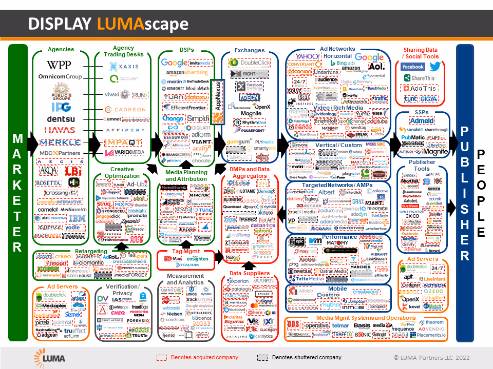
The first UX Research Tools Map was launched in 2019 as User Interviews’s answer to this famous (and famously overwhelming) LUMAscape graphic, which made the vastness of the marketing software landscape clear.
Almost as soon as we began creating our first UX Research Tools Map, we ran into a challenge that UXers will be very familiar with. Namely, we had an information architecture problem. As Erin May wrote at the time:
“Once you’ve done the hard, subjective work of defining categories, many of the tools you use every day fall into at least 2 buckets. We thought a perhaps more useful and representative visual would embrace this overlap. That way you can avoid the overlap you don’t want, get it where you do want it, and hopefully quickly get a sense of where you might want to dig deeper depending on your needs.”
The result was a subway-style map, with software plotted at the intersections of various lines, each representing a feature category.
It was hugely popular. So, we did it again the next year. And the year after that.
.avif)
The challenge was, the UX research tools landscape kept growing, and UXR platforms kept adding new features and functionalities. As a user researcher, that’s not a terrible problem to have—it meant greater access to more tooling options with more robust, purpose-made features, and competitive pricing. But from an design perspective, it presented an even greater infrastructural challenge.
In 2020, Holly Holden (Senior Visual Designer) and I (Katryna Balboni, Content Director) found ourselves staring at spreadsheet upon spreadsheet and Figma file after Figma file. We wondered how on earth we were going to plot over 200 tools—especially when more and more platforms were taking an “all-in-one” approach to user research tooling, offering ever-more complex suites of UXR features that just would not cooperate with our existing schema.
We wanted our map to reflect the increasing complexity and interconnectivity of the user research software landscape. But in order to do that, we had to streamline somewhere. We did this by sorting tools into categories based on their core functionalities, and by limiting the number of tools in each category to five (we included ~1-3 well-known and broadly popular options, ~1-2 robust enterprise solutions, and ~1 "dark horse" or alternative option).
In the end, the 2021 UX Research Tools Map featured 100 tools, with a database of over 100 more available to download for the first time. It looked slick (it was obvious we had a real designer on our team for the very first time), but we received valid criticisms about the usability of the map as a tool for navigating the UXR software landscape (which was kind of the whole point). We also heard from a number of companies who were disappointed they didn’t make the cut. 😔
For the 2022 edition, we wanted to include as many tools relevant to the research lifecycle as possible. But we were frankly spooked by the prospect of plotting hundreds of tools to fit on the correct subway line or station.
So we decided to take a rather different approach. We scrapped the subway theme altogether, in favor of a geographic map that gave us more flexibility when it came to plotting tools in their appropriate regions.
Because I—a failed medieval historian—was watching a lot of high-budget fantasy television at the time, the map inevitably took on a historical fantasy theme.
%25201.avif)
Fun, right? People loved the new theme and we received great feedback—but we also heard from some folks that the new approach was less intuitive than it could be, and that they relied on the tools database we provided to find what they were looking for. We agreed, and made usability a top priority when scoping the project in 2023.
EXPLORE THE 2023 UX RESEARCH TOOLS MAP
Methodology and design
If last year’s map represented a dramatic break with tradition, this year’s edition represents an evolution (not revolution) of that concept and approach.
Over a period of roughly two months, from September to October 2023, we:
1. Conducted design exploration
In 2022, Holly and I took turns adding visual design inspiration to a shared Figjam board, in which we made notes about the elements of each example that we liked (or disliked) for our own Tools Map.
Again, we ultimately decided on a historical fantasy theme, with a flat background and “hand drawn” illustrations.
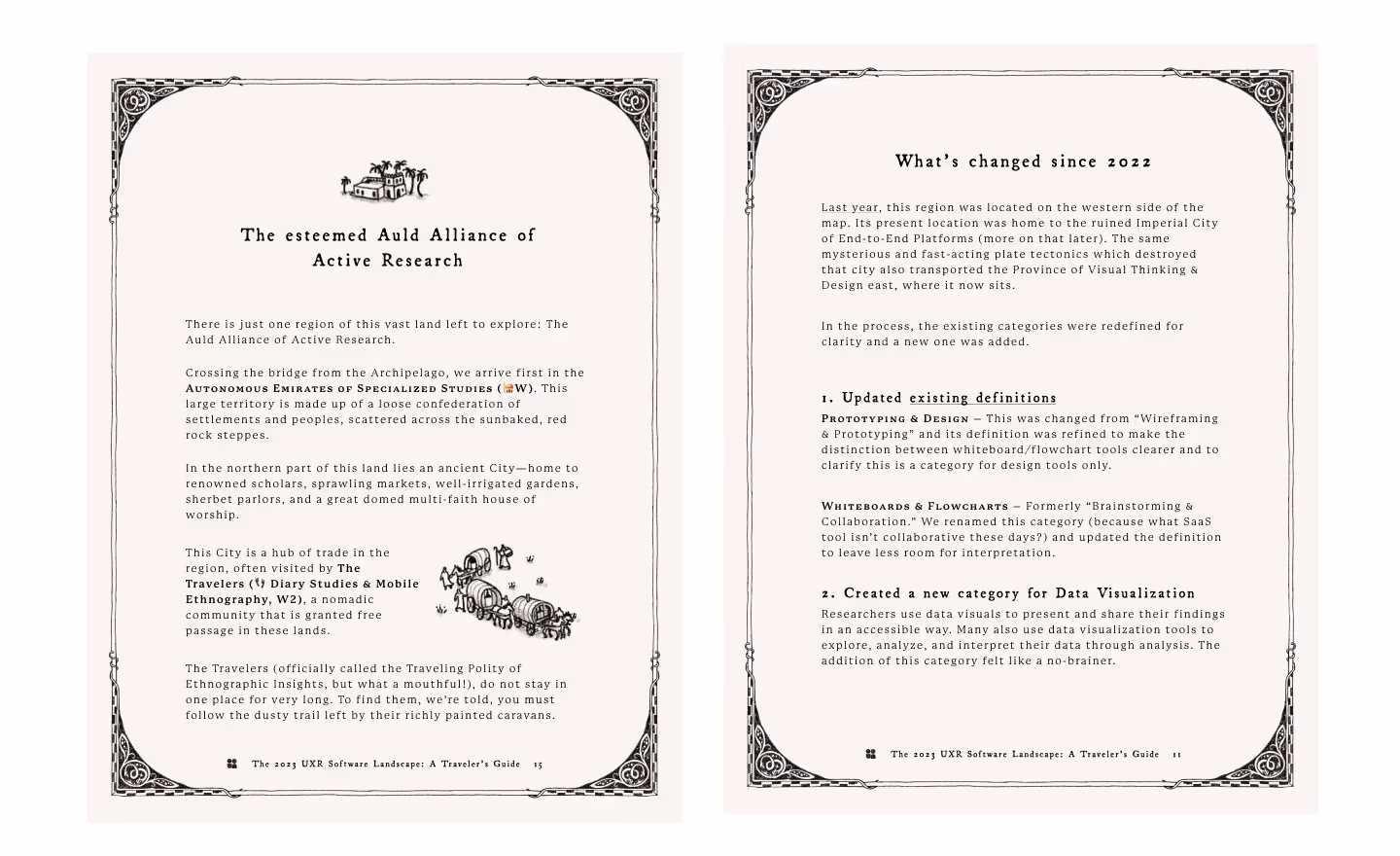
We happily stuck with the theme for 2023, and used this time to iterate on the previous design exploration, adding elements that gave the map a more “worldly” feel. Together with the incomparable Olivia Whitworth, we brainstormed ways to make the regions feel more culturally distinct.
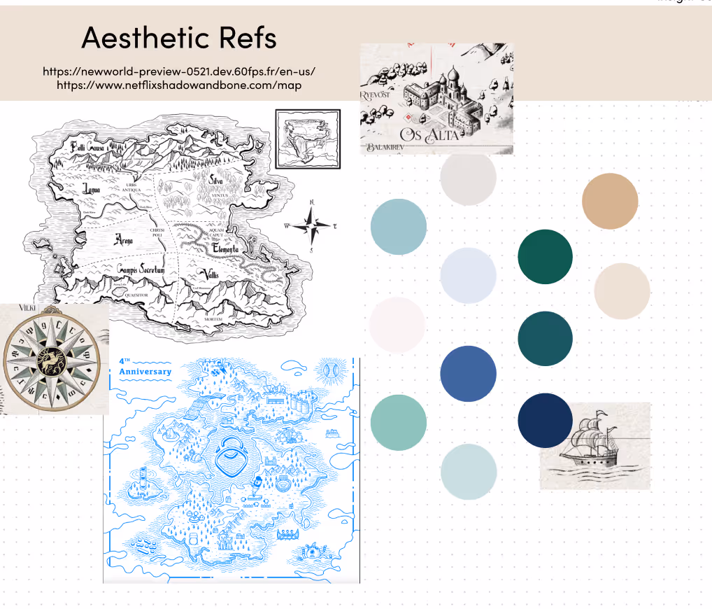
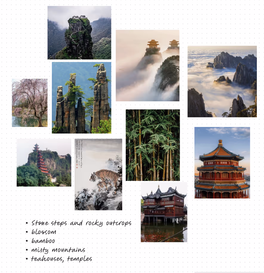
For instance, you’ll notice that while the Grand Duchy of Insight Management kept its English countryside vibes, the Province of Visual Thinking and Design now draws inspiration from landscapes depicted in Classical Chinese art, while the High Kingdom of Recruiting and Panel Management is reminiscent of mainland Greece.
With Olivia on the team, we knew we’d be able to render these ideas with detail and clarity.
2. Defined (and redefined) UXR software categories
As ever, design exploration was the easy part. Next we had to align around a schema for categorizing the tools on our map. Should we add or remove any categories? Did the names we’d given to buckets in past years still apply? What system of categorization would be most useful for researchers consulting this resource as part of the evaluation and buying process?
This was not a one-time step—we had to revisit our categories and definitions as the tools list grew in order to accommodate the new tools that we added (especially those powered by AI).
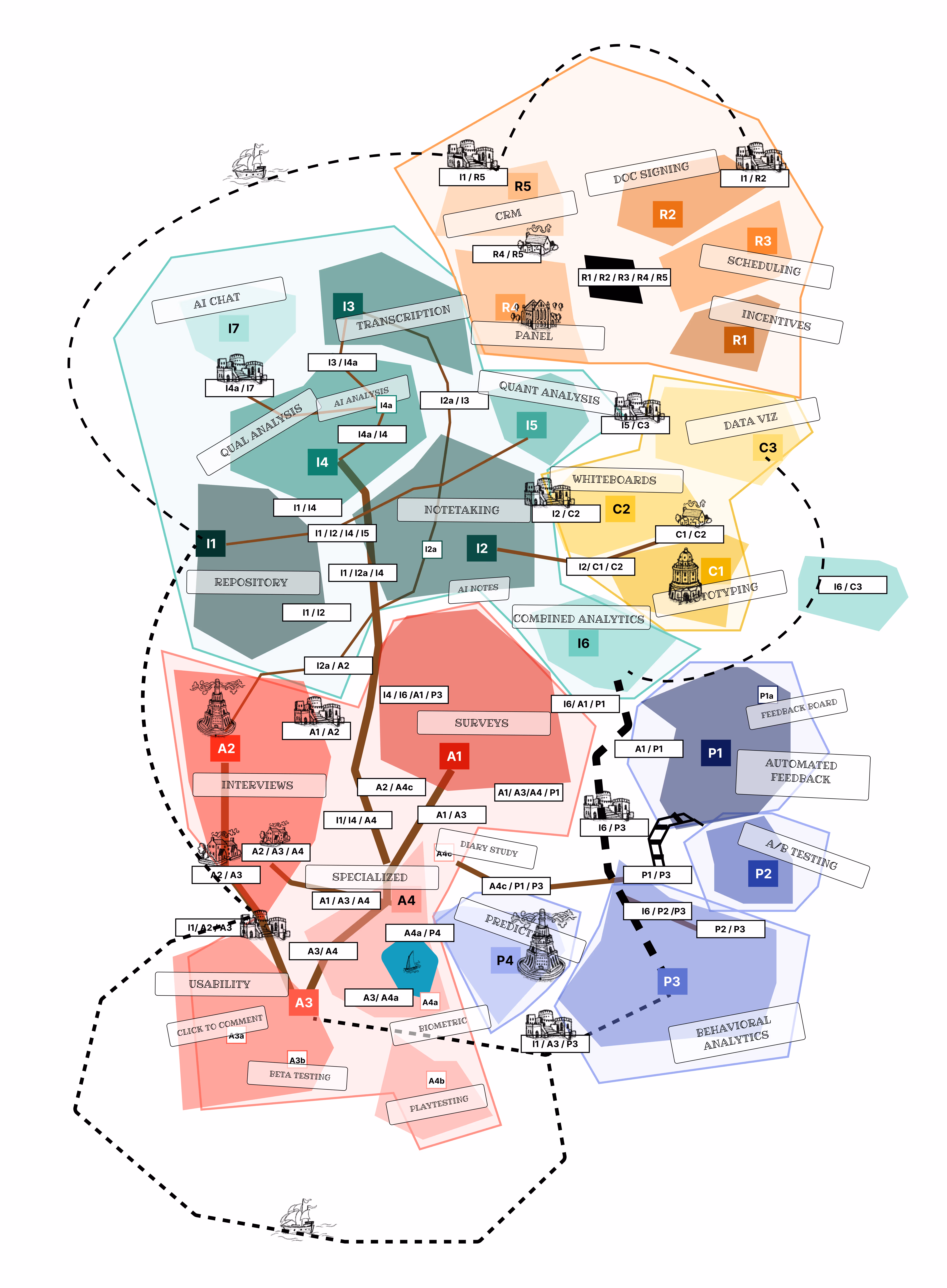
The 32 categories we arrived at are detailed in the “Guide to the UXR Software Categories” section below the map. Changes from previous years are explained in The 2023 UXR Software Landscape: A Traveler’s Guide.
3. Compiled a list of tools
Next, I had to do some research. We had our 2022 list, of course. But things change. Companies get acquired, new software launches, old favorites get new features…
First, I QA’d last year’s list to find out which tools had been acquired, sunset, or evolved since 2022. This essentially meant that I spent days clicking through hundreds of websites and checking them against our existing information. A few notable acquisitions that are reflected on the map:
- Confirmit (acquired by Forsta)
- Consider.ly and TryMyUI (acquired by Trymata)
- EnjoyHQ, Validately, UserZoom (now part of UserTesting)
- Feedback Loop (acquired by Disqo)
Then I consulted the data from our 2023 State of User Research, 2023 UX Research Software Report, and the 2023 AI in UX Research Report, which together contain insights from over 2,000 researchers and people who do research. I combed through open-response questions to find mentions of tools—or categories of tools—that were missing from our list. I also used a combination of Google and ChatGPT to search for additional tools in each category.
I ended up with a preliminary list of over 530 tools. Now, we didn’t want to be overly restrictive with our criteria—but the list did need some constraints. The goal was to make sure that the tools we included were relevant to UXRs.
Last year, we tried to do this through a scoring system based on popularity (the aggregate number of G2/Capterra reviews and website traffic as reported by SimilarWeb) and relevancy (was a tool designed for researchers, specifically?).
But this time around, we kept our review simpler. In general, we excluded:
- Agencies or services (vs. productized solutions).
- In crowded categories with scores of obscure players (e.g. Document Signing), we excluded some less popular or little-known tools.
- Tools strictly intended for use by non-researchers (e.g. developer software, monetization tools, robust sales CRMs or complex CX software that might get used by researchers if they’re already in use within the org but which would not otherwise be considered for purchase by UXRs)
Otherwise, if the shoe fit, we included it on our map.
Note:
Last year (and in some previous years) we tried to give companies an opportunity to provide input into their placement. So, we dug up contacts for nearly every tool on the list and emailed to ask about their tool’s features, its core use cases, and whether or not they offered a participant panel (and if that panel was agnostic), among other things. In 2022, we heard back from 25% of the list—61 companies in total. For the rest, we did further research to fill in the information ourselves.
We decided NOT to do this outreach in 2023. For one thing, there were just so many tools. For another, it introduced too much subjectivity—understandably, companies want to see their product listed under as many categories as possible, but their framework for assessing whether “Analysis” was a use case or feature was not always aligned with ours.
Instead, we used a detailed decision tree to categorize each tool according to our criteria.
4. Used decision trees to categorize each tool
For each category, I created a decision tree that addressed common points of confusion when assigning categories. It also helped that we reworked the definitions to be more explicit (less room for interpretation).
Here’s an example decision tree used to determine whether a tool belonged in the Document Signing category or not:
Is it a document signing tool?
Definition: A document signing tool made to facilitate the distribution of documents and the secure collection of legally valid signatures.
- Is the tool designed to facilitate the secure and legal collection of participant signatures on documents such as NDAs, consent forms, etc?
• Yes: Go to 2.
• No: It's not a document signing tool. - Is this a feature offered as part of a broader recruiting solution?
• Yes: It’s a tool with a document signing feature. (Code: ≈ [not on map])
• No: Proceed to 3 - You are a researcher with a complete UXR stack except you do not have a convenient and safe way to send important documents to participants for the collection of legally binding signatures. You do not need additional features. Would you consider this tool as a solution?
• Yes: It’s a document signing tool! (Code: K [on map])
• Mmm, maybe but that’s a stretch: Document signing is a secondary use case for this tool. (Code: k [not on map])
• No: Again, it’s a tool with a document signing feature. (Code: ≈ [not on map])
Here is another example, this time for Behavioral Analytics:
Is it a behavioral analytics tool?
Definition: A behavioral analytics tool collects and tracks user interactions with a product or website through heatmaps, mouse tracking, click tracking, etc. Outputs are typically quantitative data.
- Is the tool designed to collect, track, and measure user behavior within a product on an ongoing basis and at scale?
• Yes: Proceed to 2.
• No: It's not a behavioral analytics tool. - Do these tests involve recruiting users to a study for the purpose of observing their behavior?
• Yes. It's not a behavioral analytics tool.
• No: Proceed to 3. - You are a researcher with a complete UXR stack except you do not have a good solution for monitoring and measuring in-product behavior on an ongoing basis for later review and interpretation. You do not require the ability to run tests with this tool. Would you consider this tool as a solution?.
• Yes: It’s a behavioral analytics tool! (Code: U [on map])
• Mmm, maybe but that’s a stretch: Behavioral analytics is a secondary use case. (Code: u [not on map])
• No: It’s a tool with behavioral analytics baked in. (Code: ≈ [not on map])
5. Puzzled out how to fit categories and combinations on the map
Now comes the really tricky part. In previous years, this step has involved a lot of anguished spreadsheeting and dragging and dropping things in Figma—and 2023 was no different. Thankfully, I was able to apply the lessons learned last year to the process, starting with the step above, which was intended to reduce the number of categories for each tool to their most important use cases (and therefore limit the number of category combinations we’d need to plot onto the map).
If I’ve done my math right (and there’s a chance I haven’t), with 32 categories represented on the map, there are 916,312,070,471,295,400 possible combinations—5,984 if we limited the number of categories a given tool could have to three.
In reality there were “only” 71. That’s 71 locations on the map that needed to be fit together. The process is a bit like trying to assemble a blank puzzle. Thankfully, I love a puzzle.
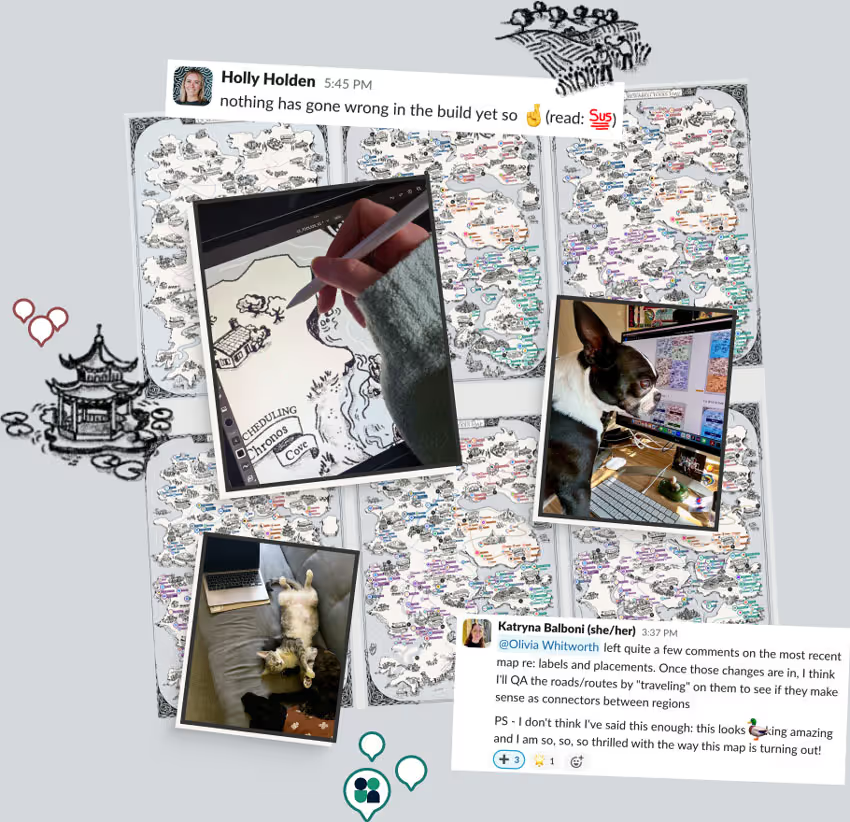
Now, maybe it was the fact that we had last year’s map to work from, or maybe I just slept well that week. Whatever the reason, it actually took me a surprisingly short time (perhaps a day) to figure out where the categories and most of the overlapping areas needed to go. While Olivia was making headway on illustrating the mountains, camels, and sea serpents that would bring this whole thing to life, I sketched out a rough layout that would become our V1 base map.
6. Went back and forth (and forth and back) on the details
Now, this is the point where, in 2022 at the eleventh hour—after days (weeks, really) of struggling to make the map look the way we wanted (fun and creative, with good usability) while also being mobile responsive, interactive, and launched (almost, kinda sorta) on schedule—Holly and I had to admit to ourselves that our reach had exceeded our grasp.

That was not the case this time around. We’d decided early on to stick with a static map (minimal interactivity), which gave the whole crew the time we needed to focus on the illustration, site build, and storytelling.
Over the next month or so, Olivia created I-don’t-even-know-how-many versions of the map, each reflecting feedback from me and Holly as we built out the experience in Webflow (Holly) and repeatedly QA’d the list of tools and their placement on the map (me). We redrew roads and coastlines, added labels to make category combinations more obvious, and threw a late-addition monk or two into the mix.
As part of QAing the map, I created the Traveler’s Guide, which is a narrative overview of the landscape, starting from point A (Research Repository) and ending at Z (Surveys). I “walked” each road to make sure the routes made sense, and looked for opportunities to clarify labels or create a bit of white space. And all the while Olivia executed on all these edits like the absolute pro she is.
Meanwhile Holly made sure that the Webflow site experience was clean, intuitive, and user-friendly.
7. Released the kraken
The 2023 UX Research Tools Map was launched on October 27, 2023. Along with the map (which you can view online or download as a high-res JPEG), we’ve included several resources to help you get the most out of this year’s edition.
For the first time ever, we even included a Figma template with a blank map that you can customize with icons, logos, and labels of your own. Use it to visualize your own tech stack to share with stakeholders, or identify gaps in your tooling. Or you know, just have fun.

Here are all the ways you can explore the UXR Tools Map:
- Navigate the realm online (recommended)
- Download a PDF copy of the map (PDF)
- View the full list of tools (Google Sheet or Excel)
- NEW IN 2023: Make your own map (Figma)
EXPLORE THE 2023 UX RESEARCH TOOLS MAP
The tools we used
The 2023 UX Research Tools Map is an ode to Tolkein, A Song of Ice and Fire, all the amazing queer, feminist, non-Eurocentric fantasy being published right now, my random Master’s degree in medieval history, my continued frustration about not being able to run CKIII on a Mac, Olivia’s talent, Holly’s roll-with-the-punches attitude, the tireless teamwork of the entire UI crew, and the age-old art of just totally making up maps.
But before it is any of those things, it is a guide to the tools that matter to UXers, now. We tried to keep the map neutral (can you blame us if our logo just happens to look a little special?), and made no recommendations about which tools we think ought to be in a researcher’s toolbelt.
Still, we have our own go-tos, several of which we reached for in the course of this project.
Specifically, we used:
- Google Docs for all the things you’d expect: project briefs, collaborative docs, the draft of this blog post
- Notion for design project planning
- Google Sheets to organize the tools list, keep track of CMS upload progress, and lots of mind-melting scratch work as we figured out how to plot things on the map
- Figma for collaborative wireframing and design
- Adobe Photoshop for illustrations
- Webflow to build the landing page, including the CMS search tool (and the scrapped interactive version of the map)
- Markup to QA the Webflow build at multiple design stages
- Slack and Asana for project updates and task management
The team behind the UX Research Tools Map
As always, this project was a heroic team effort.
Leading this project we had myself (Katryna Balboni, Head of Creative Content & Special Projects) in charge of research and storytelling; Holly Holden (Senior Visual Designer) in charge of web design; and Olivia Whitworth (Illustrator) in charge of making this thing look heckin’ gorgeous.
Additionally, we received support from:
- Ben Wiedmaier, Royal Wordsmith
- Erin May, Senior Empress of Marketing & Growth
- Zoe Nagara, Senior Countess of Product Marketing
- Jed Fudally, March Lord of Growth Marketing
- Casey Galpol, Royal Herald of Lifecycle Marketing
Learn more
User Interviews is the fastest and easiest way to recruit quality participants for research. Get insights from any niche within our pool of more than 6 million participants through Recruit or build and manage your own panel with Research Hub, the first CRM designed for researchers.
Our tools make sourcing, screening, data consent, scheduling, messaging, incentives, and all aspects of research recruiting simpler. For enterprise orgs, we offer endless customizations and admin features to help large research teams stay coordinated, consistent, and compliant as they scale.
User Interviews is free to start and affordable to scale as your research needs grow.
Consult the archives
This is the 5th edition of our annual UX Research Tools Map. Click the following links to see what the user research landscape looked like in years past: 2023 ⚒️ | 2022 🏰 | 2021 🚇 | 2020 🦠 | 2019 🔧
The product I’m looking for is not on the map. Where can I share this (or other) feedback?
We’d love to hear from you. To submit a tool for consideration, flag any possible errors, or simply say “nice work, UI team,” please send an email to katryna@userinterviews.com with the subject line “2023 UXR Tools Map feedback.”