Our project builder was created by one engineer back in 2015 during the early days of User Interviews. The basic format has stayed much the same ever since. Over five years and 32,000 projects later, we recognized that the builder needed some love. So, we ended 2020 with a massive undertaking—overhauling our project builder.
The ‘why’ of this project was a no-brainer. After all, the User Interviews user experience starts with the project builder. Stumbling through the project setup because of sub-optimal UX is not an encouraging way to kick off a research project. And indeed, researchers told us they were getting stuck—or abandoning project drafts altogether. Internally, we were cemented into a design that didn’t allow for the growth, testing, and data analysis we wanted. The solution was clear: Our original project builder needed a remodel of epic proportions.
Since everyone loves a good behind-the-scenes, I went to the folks that made this transformation happen. JoJo Lee, the product designer for this endeavor, gave me a peek into the process for this build. Spoiler: It was a tall task, but through thoughtful research, keen project scoping, eye-opening A/B tests, and acting on feedback, the team made something pretty darn great.
Why we redesigned the project builder
Our old builder has served us (and our users) well. Since 2015, researchers have launched over 32,000 projects on User Interviews using the old builder, so clearly things weren’t all bad.
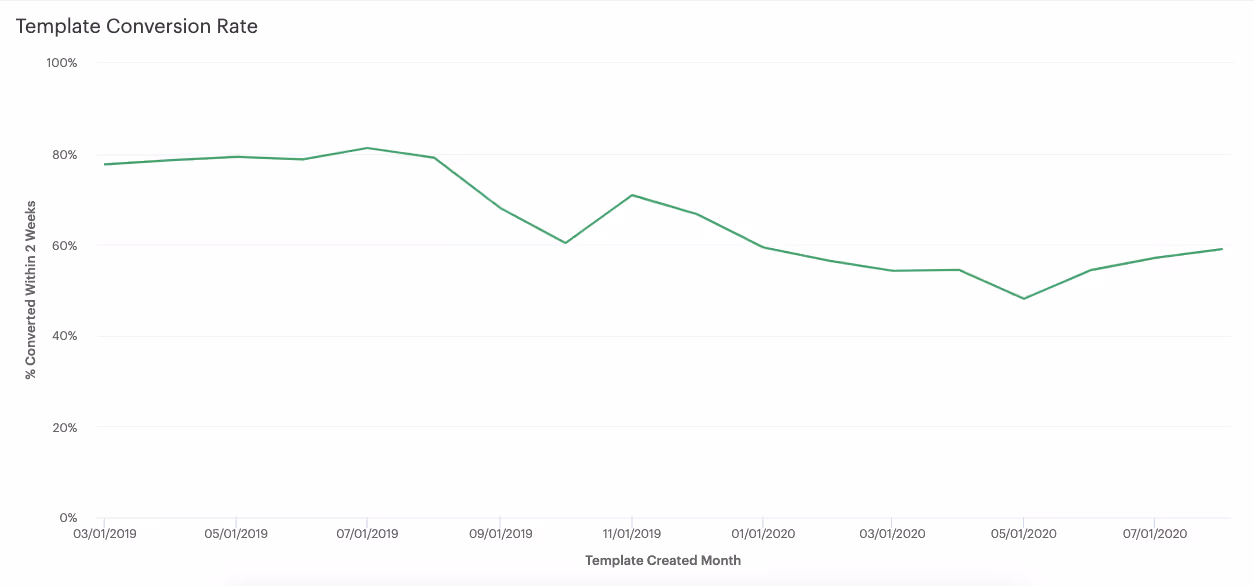
However, the number of project drafts converting into launched projects declined over the last year, and new researchers were launching fewer draft projects overall. We’re in the business of recruiting and facilitating logistics for *launched* projects, so this was concerning. Were researchers getting stuck? Did the project builder not meet expectations?
We turned to Productboard, our central location for user feedback. Common researcher complaints included poor error handling, the fact that researchers were losing work since the builder didn’t include an autosave function, and the lack of features that our users cared about. There were also clunky bits of the design that just didn’t feel intuitive; researchers often had to ask our project coordination team for help.
Internal considerations included the fact that the builder was an older design that was disjointed from our current project “workspace”, and didn’t match our latest design system. The page layouts made it challenging to add in new features, and testing the performance of different parts of the builder was nearly impossible.
Our goal: A user-friendly foundation we can build on
The primary goal of revamping the builder was to construct a new, user-friendly foundation that would allow us to test features, build new features, and evolve with our researcher base.
That meant we were in for a lot of backend work that isn’t particularly exciting on paper, but worth the “tech debt” to create something that gives us flexibility and new capabilities moving forward. On the frontend, we wanted design to reflect our workspace for a more cohesive experience. We told ourselves we’d try to fit in the error handling and autosave fixes, but those were scoped as “nice to haves.” (Spoiler: They made it in!)
For the MVP launch, we wanted to make sure the new builder experience didn’t hurt current draft-to-launch time and didn’t cause additional confusion.
The redesign process
Research + discovery
Our product designer JoJo kicked things off by doing an audit of our project builder, commenting on areas of confusion or redundancy. He then did discovery research to help inform the user experience and design. He looked at the builder-like experiences of products like Airbnb, Turbotax, Shopify, Indeed, and Gusto, drawing inspiration and noting points of friction.
📖 UX Research Field Guide: Discovery Methods
Design + prototyping
JoJo presented the team with his initial research, and they huddled for a brainstorm and sketching session to idealize design options. Those designs ended up going in directions—the “wizard”, the “participant view” workspace, and the “checklist”. We’re big fans and believers of user research around here (hopefully no surprise there), so giving users the opportunity to provide feedback throughout our design process was paramount. We showed these initial mockups to a handful of researchers to get their quick take.
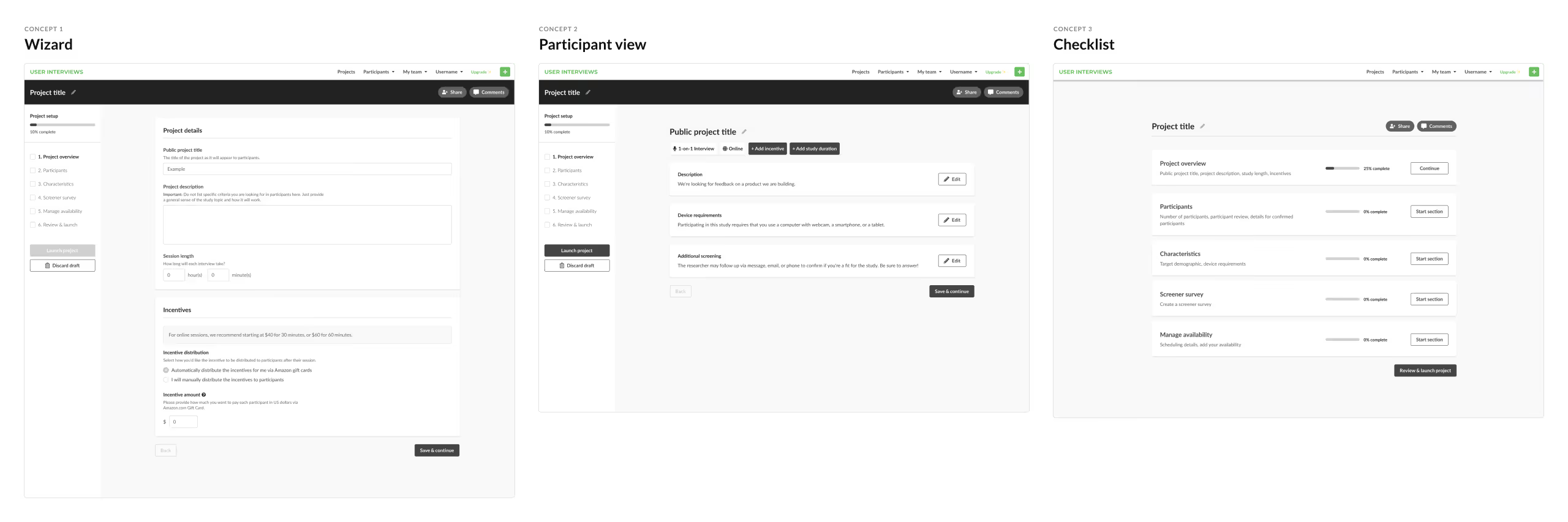
The “wizard” won out! That design was a favorite, both among our test group (for its straightforward UI) and with internal stakeholders (for its estimated technical feasibility).
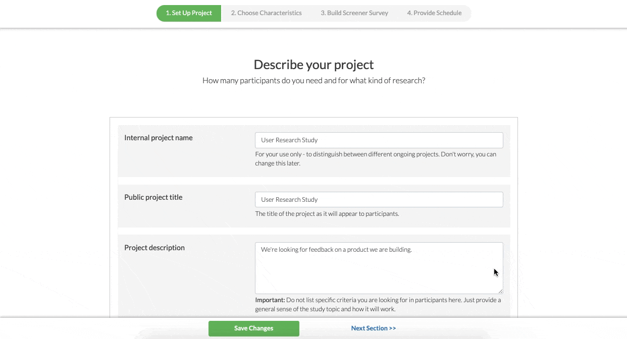
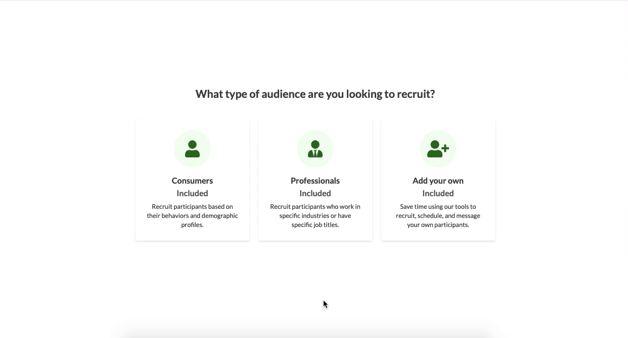
With this direction, JoJo continued designing, giving special attention to information architecture—we were keen to group and present form elements in an intuitive way. For example, in the old builder, there were instances where important features like Double Screening were haphazardly tucked in between sections that had little to do with one another.
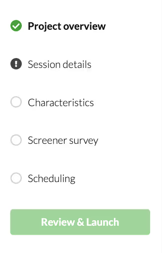
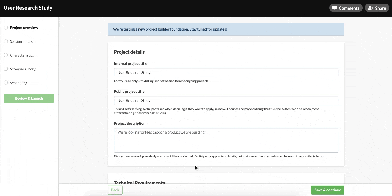
To ensure we were being intentional about grouping and placement in the new foundation, the team did a card sort with power users. Interesting learnings included the need to separate session details from participant details, and having certain elements always visible for easy access. The latter inspired our perpetual progress/navigation bar and “Review & Launch” CTA.
According to JoJo:
“Reducing friction was also a key theme for this redesign. That took the form of being able to easily jump between pages to better accommodate every researcher’s individual workflow, saving progress consistently, and providing more timely feedback on errors at the micro-level (input fields) as well as macro-level (pages)”
With information architecture, UX considerations, and UX copy in place, JoJo created a simple interactive prototype the we sent to another group of researchers. Their overall positive experience signaled we were ready to dive into development.
You can view our initial prototype here. Compare it to the final product by creating a project in the new builder!
📖 How to Use Prototype Testing to Create Emotionally Satisfying User Experiences
The build + A/B testing
Next, our engineering team got to work cooking up the new builder. We had a tight deadline—eight weeks—so we had to make some tough decisions on what was and wasn’t in-scope. According to JoJo:
“The squad was very excited at the prospect of overhauling the screener survey as a part of this effort, as that was probably the most frequently brought up pain point during our research sessions. We redesigned the interface of the screener setup to account for updated Design System guidelines, and incorporated the flow of previewing a survey. Unfortunately, after digging into the technicalities of rebuilding the screener from scratch, we realized that an overhaul of this level would require its own separate effort.”
After a few weeks of engineering effort, we released the “pre-builder” (wherein you select your audience, study type, and study format) as an A/B test to confirm that the new design didn’t hurt progress onto the next steps of the builder. After a couple weeks, we had enough definitive data to confirm that the “pre-builder” met all its marks.
While the “pre-builder” A/B test was running, our engineering team knocked out the rest of the builder. We continued to hone in on what was important, no-going any noncritical engineering work—collaboration updates, adding features like previewing skip logic, changes to how users upgrade, etc—to keep within our timeline.
A month or so later, the builder was ready in its entirety. The team then ran another A/B test with the full new builder experience; half of all research teams launching a project would encounter the new builder, and half would experience the old builder.
Our data team tracked metrics like:
- Overall project launch rate
- Draft creation rate
- Draft to launch rate
- Section reached rate
We also analyze cuts of data by different customer segments, subscription types, audience type, if the researcher was new or existing, etc to see how those factors contributed to the rates above.
This was our largest and most complex A/B test to date. And truthfully, we had some hiccups, which resulted in this test taking longer than expected. However, we were committed to ensuring the new builder would perform as well or better than the old one, so we stayed the course.
A couple months later, after gathering qualitative feedback and digging into the A/B test data, we had our answer—the new builder held our metrics fairly constant which was our marker of success, and was ready to be released to all researchers.
📖 UX Research Field Guide: A/B Testing
Launch + follow-ons
All of that leads us to this: launch day! (So named because not only are we launching the new builder but, but also because it’s the perfect day to launch a project. 😏)
We hope this peek into our process, and the *why* behind a major change was interesting, and that the new builder makes launching your next project a smooth, simple experience.
We’ll be working on “follow-on” tasks in the coming weeks, like making some copy changes and slight design tweaks to fine tune things even further. But you can start playing around with the new builder from today onward. Check out our launching a project support guide, and give the new builder a try! Let us know what you think. We always welcome your feedback!