12/17 - ✍️ Customizable footers are live in Hub
Create a custom footer to house important information and links, and make them easily accessible to participants from any page.
Some researchers have told us that they need to make privacy links and other information readily accessible to participants for compliance reasons. In response, we’ve released the option of adding a customizable footer to all participant-facing pages within the Hub experience.
You can already show a custom data consent notice to users on data collection pages. With the new footer option, you can go one step further, making important information and links available on every page.
Ready to try it out? Here's how.
To add a footer, or edit an existing one, navigate to the "Consent Settings” page from the "My Team" drop down. Scroll past the data consent notice editor to create your footer.
Type in your footer, applying basic text formatting and links. Hit save.
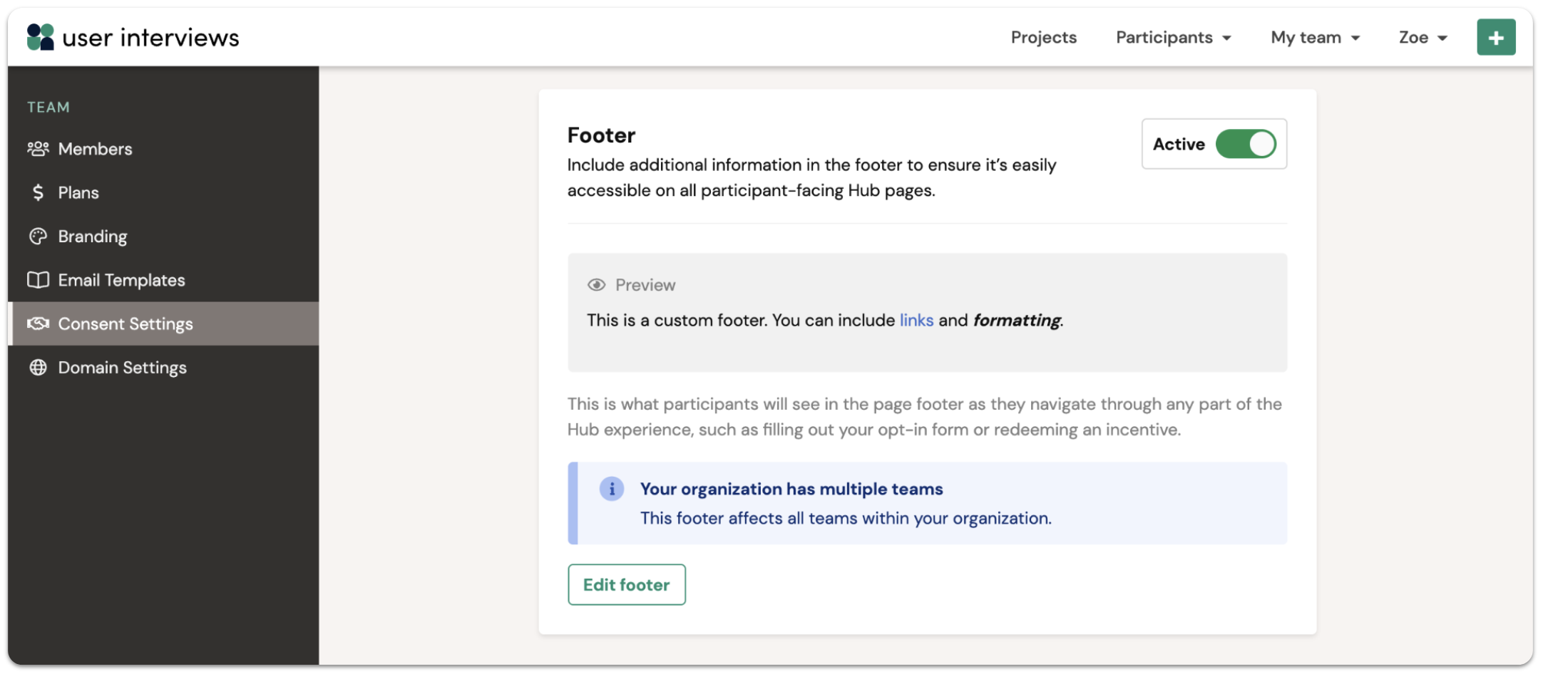
This is what participants will see in the page footer as they navigate through any part of the Hub experience, such as filling out your opt-in form or redeeming an incentive.
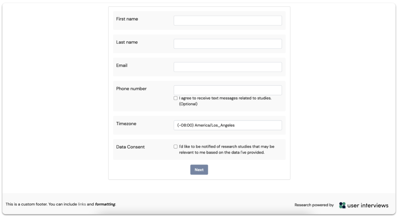
Footers are created at the organization level. If you create a footer, or edit an existing one, changes will apply to every Hub project within your organization.
This is just the latest product update we've made to help researchers handle user data in compliant ways.
December 9 - ⚙️ Apply filters to find best-fit participants, fast
Filtering your participant queue lets you quickly and precisely seek out the participants you most want to talk to.
We’ve heard from researchers that when they’re recruiting participants for studies, they often have a few essential criteria in mind, but they also care about conducting research with a balanced and representative sample. It can be challenging to manage this complexity when reviewing and making decisions about participants.
If that sounds familiar to you, read on: our latest release helps researchers with this very challenge.
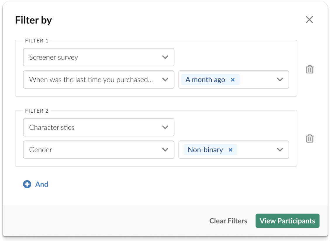
For any Recruit or Hub project, you can now apply one or more filters to the participant queue to quickly and precisely seek out the participants you most want to talk to. Combine any number of characteristics and screener questions to meet your participant recruitment and research goals — as specific as they may be.
Benefits of filters for researchers
- Speed up the process of finding the participants you want to talk to, once they’ve applied.
- Control the criteria that’s most important to your study.
- Build a balanced and representative panel.
- Manage quotas more easily.
- Simplify your workflow — get the precision you need without exporting data to analyze off-platform.
Need more convincing?
Before we launched multi-criteria filters, we ran a test with just a single filter available to researchers and saw:
- 27% decrease in file exports, which had previously been used as a workaround to analyze participant data off-platform.
- Improvement in profile views per approval from 2.8 to 2.2, suggesting that researchers were able to apply filters to get more efficient at pinpointing the profiles they wanted to approve.
- 26% more projects approving their target number of participants within 24 hours of launch, meaning more projects were being fulfilled quickly.
The nitty gritty about filtering
Here are all the details on how the new filtering functionality works.
- Multiple selections within a single filter are treated as or statements. For example, if you apply a filter for “Level of education” and select “Bachelor’s degree” and “Master’s degree”, participants who have either a Bachelor’s degree or a Master’s degree will be displayed in the results.
- Multiple filters are treated as and statements. For example, if you apply a filter for “Gender” and select “Woman”, then apply a second filter for “Employment status” and select “Full-time employed”, only participants who identify as women and are also full-time employed will be displayed in the results.
Learn more in our filtering support guide.
October 25 - 📝 Format data consent notices in Hub
Customize your consent notice, apply formatting, and link out to a more detailed privacy policy.
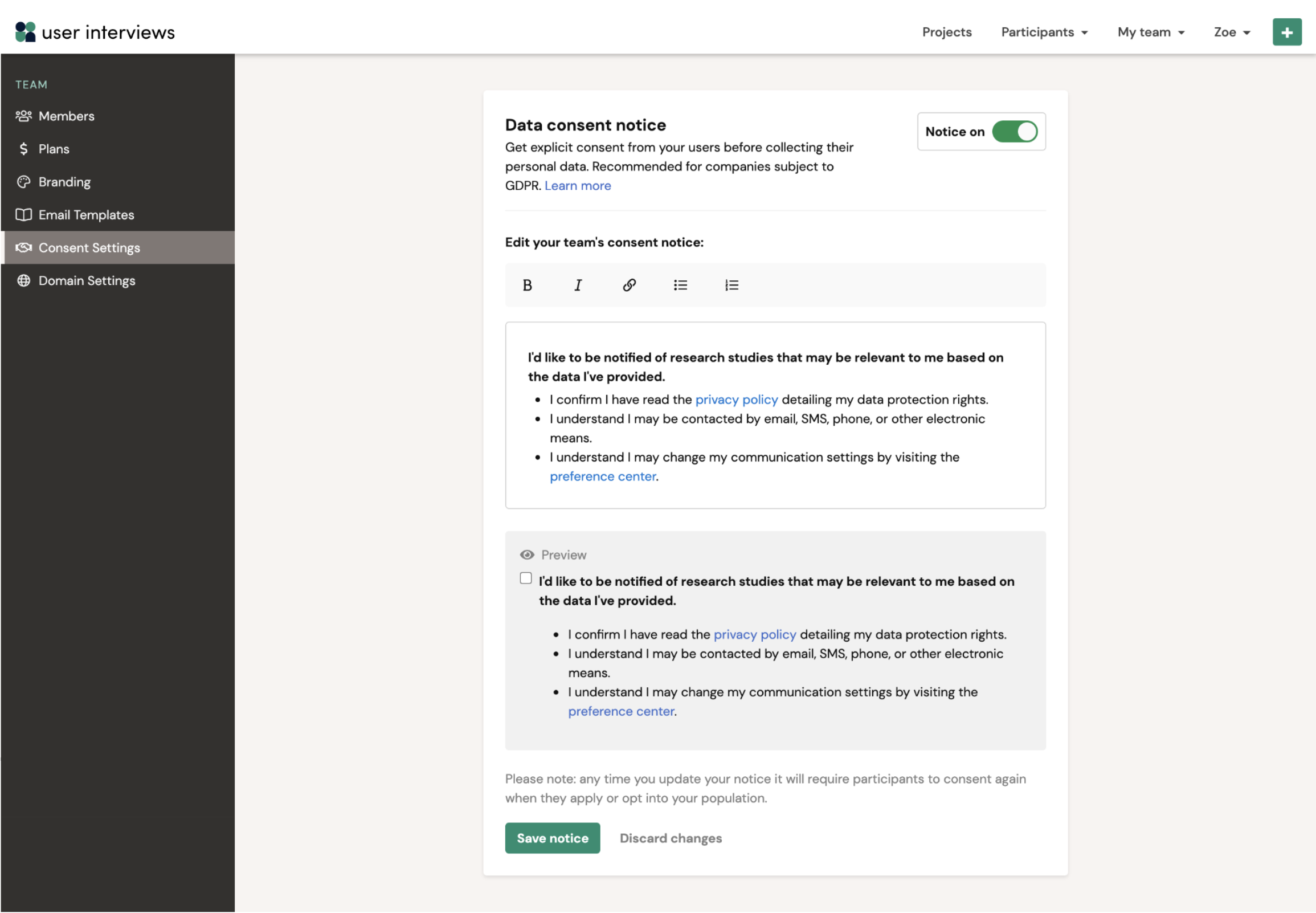
Researchers care about handling personal data in compliant ways — a cause we wholeheartedly support! With our new data consent notice editor, you can customize your consent notice, apply text formatting, and link out to a more detailed privacy policy.
Note that any changes you make to your data consent notice will apply to all Hub projects within your account.
As a reminder, data consent notices allow you to request explicit consent from your panel of participants on Hub. This helps companies subject to GDPR and other compliance policies ensure they have a current record of consent every time a user joins their panel or applies to a project.
Learn more in our data consent notice support guide.
October 12 - ⚡ Previous/Next buttons for easy navigation between participants
Stay in the review flow and move from one participant profile to the next with a single click.
Sometimes you release a small update without much fanfare, and you are blown away by the strength of the response from users who have found and adopted it. When we launched previous/next buttons on the participant profile view, we thought we were just making a modest improvement to the review workflow. Turns out, this was a huge hit with the researcher community!
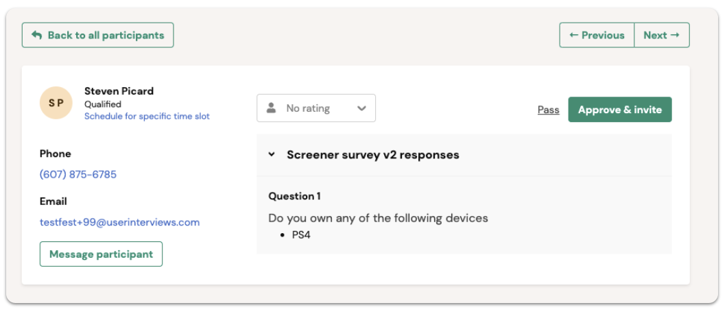
Using the new previous/next buttons, you can now navigate between participants’ profiles with a single click. This is great news for time-constrained researchers who need to consider more participants in less time.
Move from one participant profile to the next without needing to return to the project participant table. Fewer clicks = less friction = a more delightful review experience :)
October 12 - 📊 Email metrics and follow-up invites for Hub project invitation emails
Get better response rates to your Hub project invites.
We’ve released two new features to help researchers up their project invitation game.
Analyze your emails
Have you ever hit send on an invitation and felt like your email has entered a black hole? Not anymore! With new email metrics available for Hub projects, you have visibility and control over email performance.
View aggregate stats on email engagement such as emails delivered, opened, clicked, and bounced.

Re-send invitations
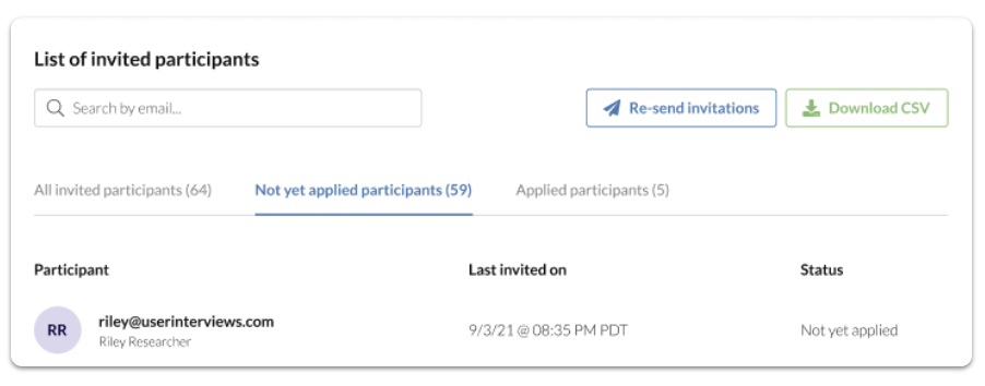
A natural follow-on from email metrics, you can now trigger follow-up invitations to previously invited participants who haven’t yet applied. This feature can help you to boost overall applications for Hub projects.
Optimize subject lines and adjust email copy to improve response rates the second time around. Track the status of each invitee with timestamps and application status easily viewable.
October 11 - 💼 Better B2B targeting with structured job titles
Job title targeting just got a lot easier — and more effective.
When recruiting for a B2B project, you no longer need to type out every job title in full. Instead, start typing then select relevant titles from the dropdown list.
Structured data results in better matches. With this update, researchers and participants are now selecting from the same set of job titles, meaning you can better target professional personas for your studies.

September 14 - 👀 In-line skip logic for screener surveys
Preview skip logic in real time and easily tweak and troubleshoot your screener surveys.
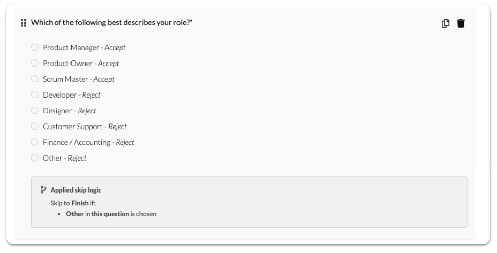
Skip logic helps to keep screener surveys short and personalized, but the logic can get pretty complicated! Now, you can preview how skip logic applies to each question in real time as you are creating and editing a survey.
In-line skip logic is displayed on the screener survey pages of the project builder and project workplace. This makes it quicker and easier to preview skip logic, and saves you time troubleshooting.
August 28 - 💯 Match percentage scores for applicants
Quickly see how qualified an applicant is, and identify potential new matches who came close to qualifying.
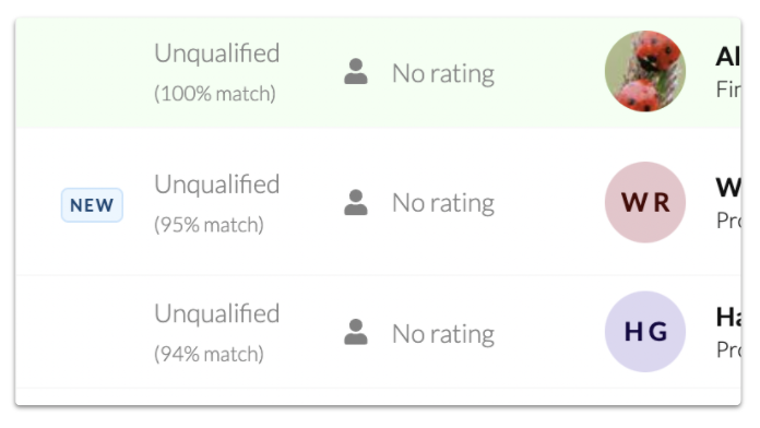
Researchers can now see match percentage scores for applicants to a study. This helps researchers by providing transparency about how qualified an applicant is, and may also help to find potential new matches who came close to qualifying.
Scores are based on how closely matched the applicant’s characteristics and screener survey responses are with the researcher’s desired characteristics and responses. By default, the participant queue is ordered from most to least qualified based on this score.
Learn more in our match percentage support guide.
June 24 - 📆 Participants can sync their calendars
We’re making it easier for participants to manage their schedule.
Participants can easily add confirmed sessions to their calendar with new “add to calendar” buttons for popular calendar applications. Participants can also connect their Google Calendar to User Interviews to auto-add sessions as they are confirmed.
We already have low no show rates, but we want to make it even easier for participants to manage their schedule, get session reminders, and access meeting links.
Learn more in our participant calendar management support guide.

June 4 - 🔍 Preview screeners + test skip logic from the project builder
Catch skip logic errors before you launch
Broken skip logic *was* a headache—if you didn't notice an error before launching, participants would likely get sent to illogical pages or finish logic would end the screener too soon, making for incomplete or nonsensical screener applications. In most cases all of those applications would need to get thrown out, as they didn't accurately qualify or disqualify participants, slowing down the recruit.
No longer! You can now preview your screener survey, including the option to test all skip logic paths, before launching your project. If you catch any skip logic mistakes where branching didn't work as intended, update the logic statement and test the path again. Catching errors before your project launches should make for a stress-free recruit!
Previewing a screener, even if the screener doesn't have skip logic, is also a good way to QA the general experience from a participant's point of view. For example, notice if your screener feels long or tedious, if the questions are clear, if all multiple choice responses have a "None of the above" or "N/A" answer option, of if you catch any grammar or spelling mistakes.
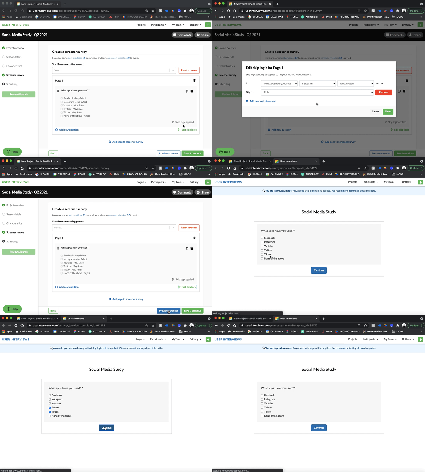
Learn more in our skip logic support guide.
May 27 - 📌 Sticky first column + header on the Hub participants table
Never lose your point of reference when viewing Hub participant data
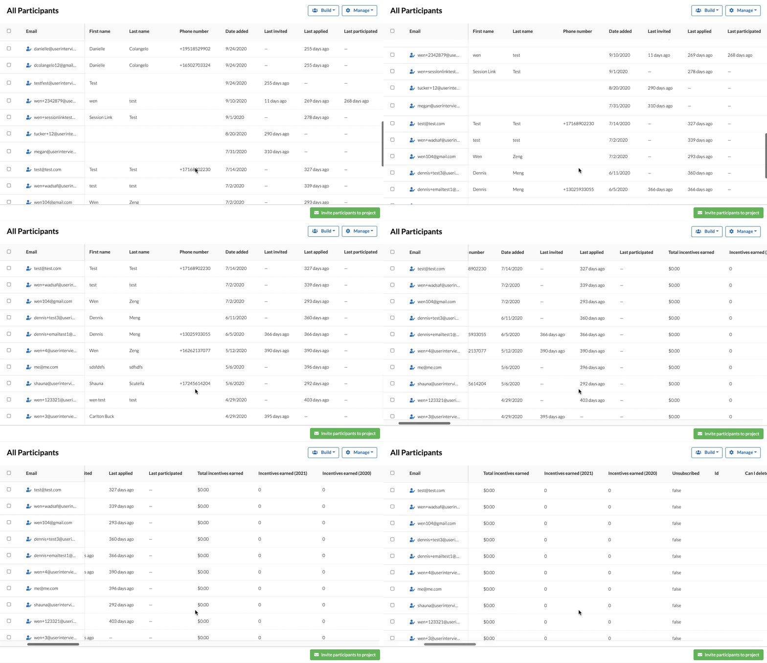
Reviewing Hub data just got a whole lot easier! The first column holds constant when scrolling horizontally, helping you keep track of which participant's data you're looking at, and the header is always in view so you know what column of data you're looking at when scrolling vertically. More Hub table user experience updates are coming H2 2021!
May 4 - ➕ Create and activate multiple Hub opt-in forms
Use different opt-in forms to build your Hub participant panel
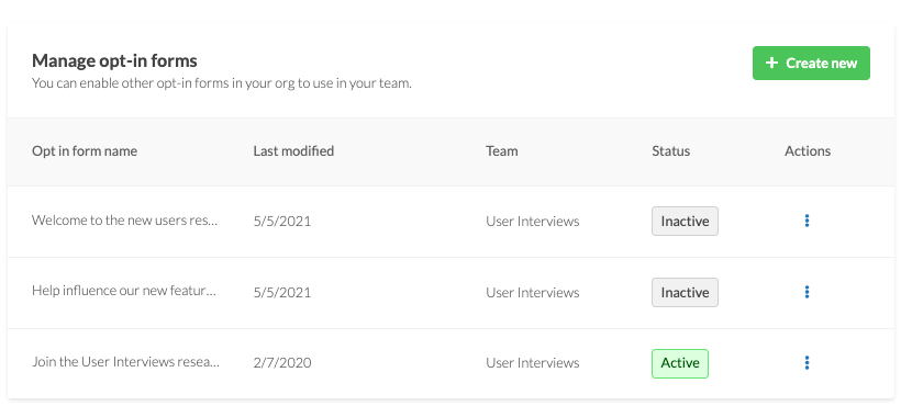
A win for teams with multiple brands, products, or those who just want ask different questions to different groups. Your team can make and activate as many opt-in forms as you want!
Simply copy the URL for the opt-in form you'd like to use, and add it to an email, social media post, Slack channel, etc to grow your panel. Use different opt-in forms with persona specific questions to gather specific information on participants as they're joining your panel. Use that information to filter or inform who you invite to your next study.
Learn more in our opt-in forms support guide.
April 25 - 🗑️ Duplicate and delete Email Themes + Email Template Sets
Added functionality for our Hub email customization tools
Two of our Hub email customization features, available for paid Hub subscribers, have expanded functionality.
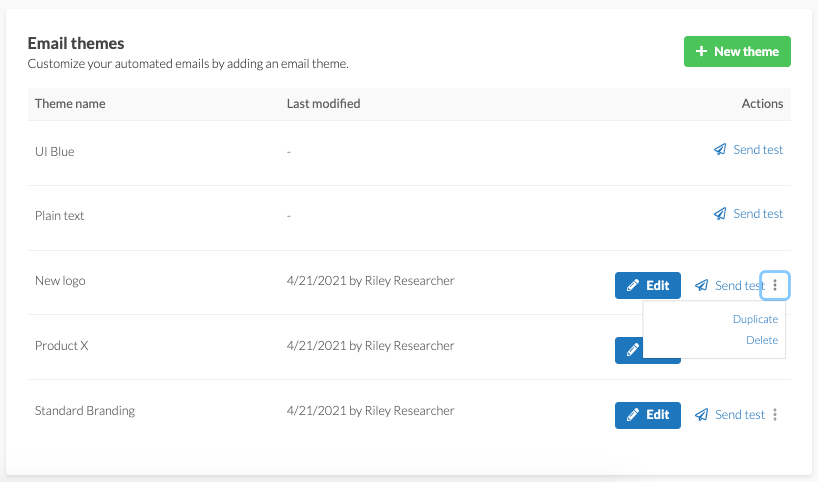
- Duplicate Themes and Template Sets so you don't have to start from scratch, or build off of what you've already created without getting rid of the original.
- Delete themes you no longer use so Themes and Template sets stay tidy and up to date.
- View who modified the Theme or Template Set last, and when it was last updated.
We hope this helps you and your team use these tools more effectively! Learn more in our Email Themes support guide and Email Templates support guide.
April 21 - 📩 Send a document to sign post launch, download a copy in-app
New Document Signing capabilities
You may forget to add a document when building your project, or decide to add one once participants are already confirmed. No problem! Teams with the Document Signing add-on can now ask their Project Coordinator to add a document post-launch, and then the researcher can trigger sending that document to confirmed participants who haven't signed the document yet.

When a participant signs a document, the project owner will automatically receive a signed copy of the document in an email. We know emails can be lost, deleted, or forgotten, so we've made it possible to download the document in-app whenever you need (even after the project closes!). Collaborators can download the document as well, helping teammates pitch in on saving or reviewing NDA's or consent forms.

Learn more in our Document Signing support guide.
April 12 - ✨ The project builder has a new look
Creating a project has never looked better!
We updated the design and behind the scenes “foundation” of the project builder. That means no new functionality (for now!), but lots of benefits moving forward. Learn more about the project builder in our support guide.
The new project builder foundation:
- Allows us to add more of the highly requested features you’ve asked for. Our old builder wasn’t created with product evolution in mind, which meant we were limited in the things we could add to it. The new foundation gives us much more room to grow with our users. Tell us what features you’d like to see added!
- Helps us better test and monitor parts of the builder. We seek to be data driven, and the new foundation gives us more tools to do that. We’ll use those learnings to inform product updates.
- Gives us more flexibility and ability to iterate. We were a bit cemented in place with the old design. The new builder gives us the option to move things around and iterate based on your feedback and data.
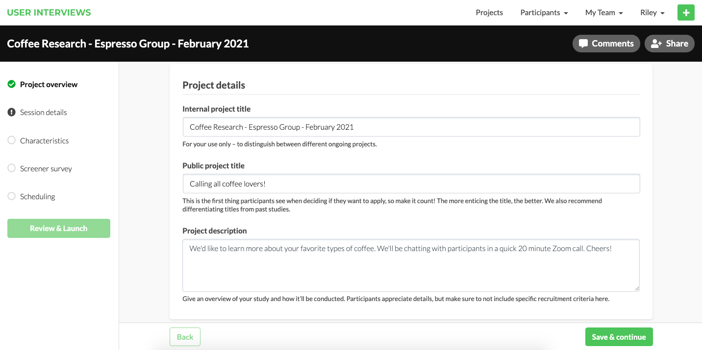
Ultimately, we want launching a project to be easy as pie, and this update helps us work toward that goal. Give the new project builder a whirl! Launch a project and let us know what you think.
Curious how it all came together? Read our blog post about the redesign where we cover more about the whys and hows of the project.
March 26 -💰 New Incentive Option
Participants now have their pick of dozens of gift cards when UI automatically distributes incentives
Formerly, when you opted to have UI automatically distribute incentives for your team, participants who completed your sessions would be paid an Amazon gift card. Researchers and participants alike requested an alternative to Amazon. We're excited to share that a new option, Reward Link, is here!
Participants will now have their choice of a digital Amazon OR Reward Link gift card for UI distributed incentives. When a participant chooses Reward Link, they'll be prompted to redeem their funds in their pick of dozens of popular store, service, and experience gift cards, including options like Target, Starbucks, Southwest Airlines, Airbnb, Whole Foods, Home Depot, and Uber.
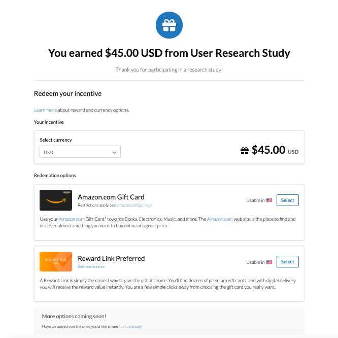
Participants can choose a gift card that fills a need for them, or simply just makes them happy! Researchers who want to give participants incentive options can now take advantage of UI automatically distributing incentives for their team, saving them time and legwork of manually issuing incentives themselves.
Learn more about our the incentive and currency options available to participants in our support guide.
January 7 - ✉️ Email Template + 💙 Participant Referrals
Email Template—add custom messaging to templates to use over and over again
You’ve worked hard to build up a panel of engaged participants, and care about how you communicate with them. We’ve added a new tool to our paid Hub subscriptions—email template sets—to help you do just that!
Maintain your tone and voice through your project by creating a custom email template set. Make a template set once and you and your team can reuse it over and over again, saving time and ensuring participants receive emails that sound like YOU. Learn more about email template sets in our support guide.
A few ways we’re using email template sets:
- Keep terminology consistent across emails
- Add our own greetings and signoffs
- Include personalized signatures with pronouns
- Update subject lines to include other information

For paid Hub subscribers who want to keep branding and messaging consistent, check out our other features that help streamline communication:
- Update the look and feel of emails by creating an email theme
- Set a sender profile so participants better recognize your emails
Participant Referrals—refer a friend, get $30!
A big win for our participant community! Participants can now refer a friend to occupation based studies. Their friend or colleague gets paid for participating in the study, and they get some extra money in your pocket. For researchers, this will help us fill more niche occupation studies. A win-win all around!
Here’s how it works: Simply use the unique referral link to refer someone you think may be a good fit for a specific study. If your referral creates an account and completes the study you refer them to, you earn a $30 Amazon gift card. Learn more about referrals in our support guide.

Check out our 2020 Release Notes for more release details!


.png)


