Hear ye, hear ye! The 2022 UX Research Tools Map by User Interviews has arrived!
The fourth annual UX Research Tools Map is an illustrated guide to the ever-changing world of user research software.
This vast landscape contains almost 240 logos—some nestled in the verdant countryside of Transcriptionshire 🌳, others clinging to the stony outcrops of Prototyping Point ⛰, still more jostling for space among the narrow streets and bustling urban center of the Imperial Walled City of End-to-End Platforms 🏰.
It is intended to both awe (so many tools and features!) and to educate. The locations of the logos are far from random—each tool has been plotted according to its primary and secondary use cases, and the map is designed to help you visualize the relationship between tools, as well as the volume of solutions available for any given UXR need.
There are many ways to explore this landscape. You can:
- Navigate the Realm of UX Research using the map (more on that below)
- Use the search feature to filter by use case(s) or find a specific product
- Download the PDF and sort through the full list of tools on your own
Keep reading for a complete guide to navigating the map, a look at how the 2022 edition came together, an overview of the tools we used, and answers to anticipated questions. In the Traveler’s Guide:
- How to navigate the Realm of UX Research
- 2022 UX Research Tools Map Q&A
How to navigate the Realm of UX Research
If you came here in search of a solution to a particular problem—be it participant recruitment or A/B testing—you can cut to the chase by using the search feature at the bottom of the page.
But as cool as it is to be able to filter the list by UXR use case, we really recommend wandering through the map itself to experience the user research software landscape in its entirety and see all the tools in context.
🧙Note: There’s a legend in the map itself, which you can consult if you’ve lost your way.
Categories in the 2022 UX Research Tools Map:
There are 6 distinct, color-coded regions of the map, which correspond to the six broad categorical buckets (insight management, recruiting and panel management, creative thinking and design, end-to-end platforms, active research, and passive insight collection).
Within these regions are 18 smaller territories that correspond to specific use cases and features (in previous years, these categories were depicted as subway lines).
Each category is represented by a different cartographic element—e.g. swaying grasslands for incentives (aka the Fields of Gold 🌾), swampy wetlands for A/B Testing tools (aka Twin Marshes 🐸), cloudy peaks for brainstorming and collaboration (aka Storm’s Head ☁️).
Some logos are clustered tightly around a category label—these are tools with a single or strong primary use case. Many more tools are located in the spaces between categories—these crossover tools are plotted by both their primary and secondary (and sometimes tertiary) use cases.
You can identify crossover territory by its mixed topography. For example, the Ancient and Unwavering River of Everflowing Insights (usability testing) cuts through various other terrains, including Feedback Fens and the Singular Steppes.
Tool categories and regions of the map:
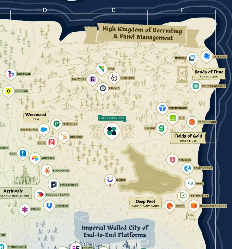
High Kingdom of Recruiting and Panel Management
Participant recruitment and panel management tools help you find the right participants for your research and streamline the participant management process by automating operational tasks related to recruiting, like incentives distribution and scheduling.
🌾 Incentives (Fields of Gold)
Incentive tools automate the task of sending incentive payments to participants.
⏳ Scheduling (Sands of Time)
Scheduling tools help you find and schedule mutually convenient times for your research sessions.
🌲 Panel Management & Research CRM (The Wisewood)
In this context, a CRM is a tool that allows you to build and manage your own panel of participants—a database with participant metadata and research history.
💧 Participant Panel (Deep Pool)
Research panel solutions help you find, recruit, and screen participants from an external pool of users, (not your own). Note: In order for us to consider its panel to be a tool’s primary use case, the panel must be agnostic. In other words, researchers must be able to recruit participants for research on any other platform, not just the platform associated with this panel.
📜 Read more: How to Break Open the Recruiting Bottleneck on Large and Growing UXR Teams
Grand Duchy of Insight Management
Insight management tools are used to store, organize, and analyze data collected through user research, passive insight collection methods, and customer-facing teams.
🌳 Transcription (Transcriptionshire)
Tools for creating a text transcription of your audio or video interviews.
📚 Research Repository (Archivale)
A research repository is a single, centralized place for storing, tagging, and keeping track of all the user research insights, data, artifacts, and relevant user feedback that you collect. Note: Tools that do not allow researchers to import data and insights from other sources do not qualify as repositories.
🎧 Hark! A podcast episode: What Librarians Can Teach UXRs about Insights Repositories with Nada Alnakeeb of DoorDash and Joanna Perez of Netflix
✍️ Note Taking (Note Taking Knoll)
Note taking tools enable you to take efficient notes during your research sessions, save them, and organize them for future analysis.
💡 Analysis (The Great Understanding)
Analysis software helps you organize, analyze, synthesize, and glean meaningful insights from research data. Note: Many testing and data collection tools have built-in features designed to interpret the data gathered via the same platform. In these cases, analysis is listed as an additional feature rather than a primary use case.
📜 Read more: Qualitative Coding: How to Turn Complex Data into Conclusive Insights
Commune of Creative Thinking and Design
Creative thinking and collaborative design tools enable you to brainstorm, collaborate, and create visuals that help you get feedback from participants and your team.
🌩 Brainstorming and Collaboration (Storms Head)
Brainstorming and collaboration software is designed to help you to collaboratively explore ideas with minimal friction.
💻 Revisit our webinar: How To Use Miro For More Collaborative UX Research
⛰ Wireframing and Prototyping (Prototyping Point)
This category includes flexible tools that help you map out the connections between ideas, steps, or sketches of a user flow, and design tools for creating a simple mockup that approximates a real product.
📜 Read more: 128 Best Prototype Templates and Examples
Auld Alliance of Active Research
Active research tools are used to conduct studies with participants to answer a specific research question or enable a particular business decision (e.g. surveys, usability studies, interviews). This is different from data collection tools that run continuously and independently of any specific research study—if that’s what you’re looking for, journey on to the Principality of Passive Insights Collection.
📹 Video Interviews (The Visions)
Video conferencing software enables you to conduct and record video calls with participants, either 1:1 or with multiple participants (e.g. a focus group).
🐪 Surveys (Surveylands)
Tools for creating a survey that you send to participants. Note: This does NOT include automated in-app surveys or screener surveys (those meant to be completed before the “real” research session to filter out qualified participants).
📜 Read more: 13 Survey Tools for UX Research
🦌 Specialized Studies (Singular Steppes)
Specialized research tools are expressly designed for the purpose of conducting a specific type of research (diary studies, field studies, card sorts, tree tests, etc.).
🌊 Usability Testing (Ancient and Unwavering River of Everflowing Insights)
Usability testing tools enable users to test out a product and share their feedback, either live (moderated) or asynchronously (unmoderated).
📜Read more: Usability Testing Best Practices
Principality of Passive Insight Collection
Passive insight collection tools collect data and insights while users interact with your product, independent of any specific research project. Product analytics, voice of the customer (VoC), and automated in-app surveys fall into this category.
🌿 Automated Feedback (Feedback Fens)
These tools allow you to trigger automated feedback requests at key points in the user experience (e.g., NPS surveys, in-app polls).
👁 Session Analytics (The Eye)
Session analytics tools allow you to track and analyze user interactions with a product in real time through heatmaps, mouse/eye tracking, and session recording.
⛵️ Product Analytics (Quantitative Cove)
Product analytics software is used to collect and analyze quantitative data on user behavior within your product. This category includes analytics tools used by product, marketing, and CX teams to monitor and optimize the customer experience.
🐸 A/B Testing (Twin Marshes)
Tools that enable you to show different users different variants of a page or feature, to see which variant performs best.
Imperial Walled City of End-to-End Platforms
🏰 UX research software suites offer a single solution for recruiting, analyzing, and conducting several types of user research. These tools are designed to be used across multiple phases of the research process (if not end-to-end). Often—but not always—their broad suite of tools and “all-in-one” approach means that these platforms are not as open or integration-friendly as ecosystem players with a narrower feature set.
Here be dragons
Some tools have additional visual identifiers, in addition to their relative location and cartographic illustrations.
Tools with participant panels
There are many tools that offer a participant panel which are not located next to the Deep Pool. That’s because these panels are either:
- Considered an additional use case / value add. Though they may find the panel to be a differentiator, researchers typically buy these tools for another purpose (like usability testing) first and foremost.
- Not agnostic. Some companies offer access to a pool of participants, but restrict the use of their panel to studies conducted with their own tool. In contrast, researchers can use an agnostic panel like User Interviews to recruit participants for research on any other platform, not just the platform associated with this panel.
🧙Note: Tools with an agnostic panel are shown with a maroon gemstone below their logo. Those with a restricted panel have a purple gemstone.
Sea routes
Many video conferencing platforms also offer transcription. Although these categories are located on opposite ends of the map, they are connected by a bustling maritime trade route.
Mythical beasts
There are plenty of strange and wondrous creatures that reside in the lush river valleys and craggy foothills of this vast realm. A few of them have been given their own place on the map. Specifically:
- G Dragon – A hungry and agile beast, the Great Dragon (aka Google Workspace) offers tools for video interviews, surveys, note taking, analysis, etc.
- Megalodon 365 — Another ancient and fearsome animal, the Megalodon (aka Microsoft 365) also offers solutions for video interviews, surveys, note taking, analysis, and so on.
These platforms form the backbone of most researchers’ toolkits. The vast majority of UXRs and PWDRs (people who do research) work in an organization powered by Google and/or Microsoft and will build their tool stack on top of one or the other.
One of the first and most important building blocks in that UXR stack is a powerful recruiting and participant management solution. That’s where the Unicorn of User Interviews comes in: we have two products for researchers—Recruit and Research Hub.
Recruit sources quality participants from our pool of over 2 million people. You can target professions, demographic groups, or any niche audience you’re looking for.
Research Hub helps you tap into your own customer base for research. It’s the top-rated panel software for teams that do research at scale. Grow and segment your panel of thousands (or millions) of users, then allow every researcher in your org to self-serve recruitment and automate their studies.
UI-green
We’re building the most open, integrated recruiting and panel management platform in the realm. On the map, our current integration partners can be identified by their “User Interviews green” border. You can also find this information using the search tool and the downloadable list.
The team behind the UX Research Tools Map
As always, this project was a heroic team effort.
.avif)
In addition to myself (Katryna Balboni, Content Director) and Holly Holden (Senior Visual Designer), the 2022 map was made possible by:
- Lizzy Burnam and Rachell Lee, Royal Wordsmiths
- Erin May, Senior Empress of Marketing & Growth
- Zoe Nagara, Senior Countess of Product Marketing
- Jed Fudally, March Lord of Growth Marketing
- Roberta Dombrowski, Queen of User Research, first of her name
- Basel Fakhoury and Dennis Meng, Legendary Co-Founders of the UIte Dynasty
2022 UX Research Tools Map Q&A
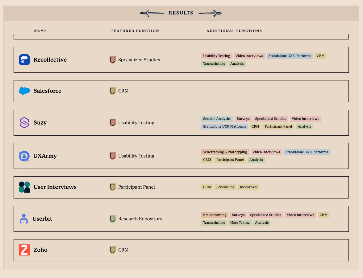
I’m looking for products with a specific feature. Is there a quick way to find that information?
Yea verily! We’ve embedded a searchable database of all 236 tools below the Tools Map. You can search for a particular feature using the search bar, or use the built-in filters to discover a list of tools that meet your criteria.
My favorite tool is on the map but not where I’d expect it to be. Why is that?
There could be a few reasons for this. For one thing, while many tools’ primary and secondary categories fall within the same region of the map or in an adjoining region, this isn’t always the case.
For video tools or testing platforms that offer a transcription feature, we prioritized its other features when determining map placement. We were operating under the assumption that UXRs were more likely to buy a tool for its video or testing features and consider transcription a nice-to-have or a differentiating feature rather than the other way around. For example, people aren’t buying Zoom for its transcription capabilities first and thinking of its video conferencing as a nice bonus.
Analysis features ≠ “an analysis tool.” Many, if not most, of the tools on the map offer some kind of analysis feature. Far fewer are actually “analysis tools'' by our definition. We considered a tool an analysis tool if researchers would consider it as a solution for analyzing data collected through research—regardless of which platform used to gather that data. For those tools with analysis features that principally exist to analyze and interpret the results of research conducted with the same product, we did not use analysis as a determinant factor in its logo placement.
We took the same approach to repository/data storage features. Most platforms that produce data or artifacts like video recordings allow researchers to store that data in a library. But unless a tool meaningfully supports importing, tagging, and organizing research results from other sources, we did not consider it a “repository tool.”
Additional use cases and features are included in the interactive database—you can click on any entry to learn more about each tool—and in the full list of tools, which you can download here.
How do I know which tools integrate with User Interviews?
User Interviews currently integrates with the following tools (with more integrations on the way):
- Google Meet
- Lookback
- Loop11
- Microsoft Outlook
- Qualtrics XM
- Sprig (coming very soon)
- SurveyMonkey
- Typeform
- Zoom
On the map, look for logos with a UI-green border—this denotes a UI integration! You can also find this information using the search tool and the downloadable list.
What’s the difference between end-to-end platforms and ecosystem players?
In recent years, there has been a proliferation of “all-in-one” or “end-to-end” research platforms, as established players continue to add new features that address additional stages of the research process.
Many of these tools are closed systems—they are feature-rich and are designed to be used across multiple phases of the research process (if not end-to-end), but are not especially integration-friendly with other tools in the space.
A pre-packaged suite of testing software might be perfect for your team, especially if you’re just getting started with UXR and have the budget for a robust platform. On the other hand, your team may have already found their favorite tools for common use cases. Other tools may simply be too baked into your organization at this point to easily replace. In that case, you’re probably looking to layer in best-in-class solutions for as-yet-unsolved UXR problems.
We strongly favor the latter, ecosystem-based approach—it’s how we do things here at UI, and it’s why we’re committed to building the most open recruiting solution on the market. If you want a slick video conferencing tool, we’re not it. But if you want a best-in-class participant recruitment and panel management platform that integrates with your favorite video tool… Well, you’ve come to the right place.
The product I’m looking for is not on the map. Where can I share this (or other) feedback?
We’d love to hear from you. To submit a tool for consideration, flag any possible errors, or simply say “nice work, UI team,” please send an email to katryna@userinterviews.com with the subject line “2022 UXR Tools Map feedback.”
Learn more
User Interviews is the fastest and easiest way to recruit quality participants for research. Get insights from any niche within our pool of over 2 million participants through Recruit or build and manage your own panel with Research Hub, the first CRM designed for researchers.
Our tools make sourcing, screening, data consent, scheduling, messaging, incentives, and all aspects of research recruiting simpler. For enterprise orgs, we offer endless customizations and admin features to help large research teams stay coordinated, consistent, and compliant as they scale.
User Interviews is free to start and affordable to scale as your research needs grow.
Consult the archives
This is the 4th edition of our annual UX Research Tools Map. Click the links below to see what the user research landscape looked like in years past: 2019 🔧 | 2020 🦠 | 2021 🚇.