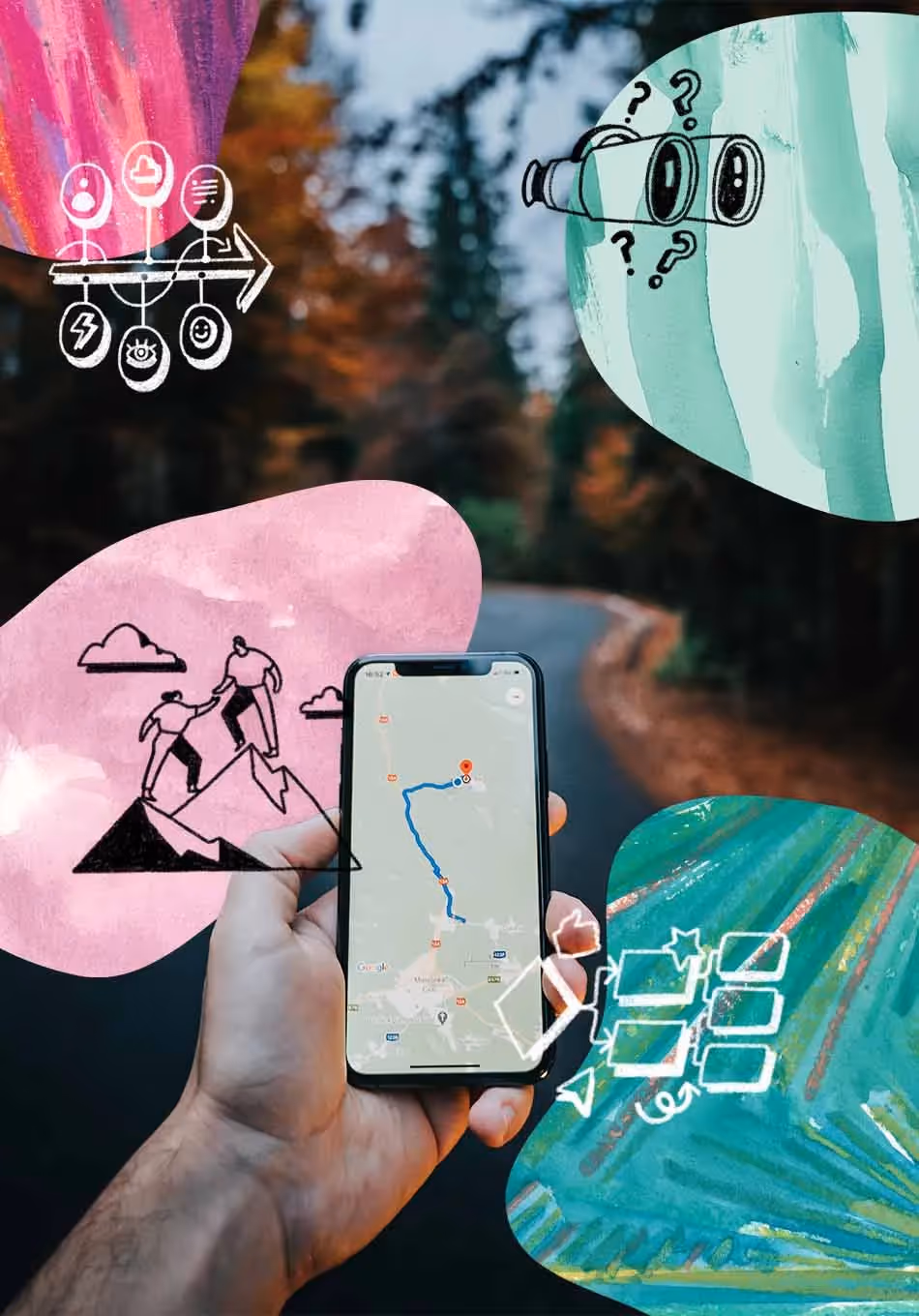
Today's user research toolkit is evolving as researchers hunt for faster paths to insights that actually move the needle on products, sales, and operations. While budget constraints have everyone doing more with less—hello, AI!—one refreshingly human-powered tool cuts through the noise: UX mapping. Yes, we’re talking about the research method that’s been around forever but keeps proving its worth.
From customer journeys to mindsets, mapping adds flexibility, power and creativity to the user experience discipline.
Keep reading to learn:
- The role of mapping in research
- The reasons to start mapping today
- Tested use cases for this approach
Speaking of maps, have you checked out our latest Research Tools Map?
What is UX mapping?
UX mapping visualizes the connections between and among relevant items: users, steps in a journey, parts of a product, etc. In mapping, both the process and the outputs are equally important. The mapping process is an effective way to organize complex information. And the format itself (a map) is an easy, visual way to communicate the research process and findings, allowing teams to quickly assess and act.
Why should researchers add mapping methods?
Mapping is a must-have for any researcher for many reasons. Here are just a few.
It’s familiar
Most corporate stakeholders have probably encountered some kind of map artifact. Marketing and Sales teams map funnels and outreach cadences; Success and Support map user journeys; Product and Engineering map development roadmaps.
By choosing to map your work, you’re using a shared visual language. Tapping into familiarity means less time explaining your process and more time discussing what the insights actually mean for their world.
It unblocks
It’s easy to get stuck in research—whether it’s generating questions, organizing fieldwork, or prioritizing analysis. At these moments, it helps to have a trusted, repeatable, and easy-to-use framework for organizing data and making decisions. Mapping can break the cognitive blocks and get you into a productive flow.
It’s flexible
No two researchers work in exactly the same way. You can adapt how you visualize items and their interrelationships to suit your workflow. Like digital tools? There are dozens of mapping options (see below). Prefer physical artifacts? Grab some stickies and string. Plus, this flexibility is key for when stakeholders pivot (again) or priorities shift overnight.
It lasts
Ever feel like no one reads your reports? When you deliver a map, you’re creating a compelling and lasting artifact. Sharing an experience journey, persona flow, or opportunity map can encourage deeper stakeholder engagement with its depth, scale, and richness. Hot tip: If it’s an option, print and display a map near stakeholders for maximum digestion.
It’s accessible
With light instruction and guidance, just about anyone can wield the power of mapping. This unlocks a range of use cases, like stakeholders mapping their workflows (to identify collaboration opportunities) or users mapping a “job” they try to get done with your product experience. Maps spur co-creation and ideation that surfaces opportunities. By making research more accessible, you’re creating space for deeper, more nuanced insights to emerge from unexpected places.
UX mapping methods
Let’s get practical. There are four primary UX mapping methods you can use throughout your research workflow: Journey mapping, affinity mapping, mind mapping, and site mapping.
Journey mapping
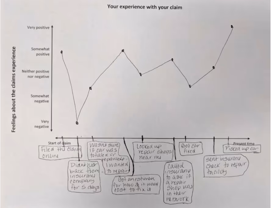
Journey mapping is the process of visually plotting the experience someone has with something over time. For example, customer journey maps visualize how customers interact with touchpoints, as well as their sentiments and pain points, in sequential order.
Affinity mapping
When you use affinity mapping, you’re categorizing and sorting all qualitative research data based on similarities (or ‘affinities’). At the end of the process, you’re left with a visual diagram that helps you easily extract insights and distill patterns in your data.
Mind mapping
Mind mapping is a thinking method that visualizes a central idea and connects the higher-level ideas and concepts that flow from it. While usually used for ideation—whether pre-session or in-session—or planning, it’s also a great technique to code and organize qualitative data.
Site mapping
A less abstract form of mapping is site mapping, which communicates structures and hierarchy of pages on a website. Site mapping runs on a spectrum of code to visualization, depending on whether the information is intended for humans or robots.
UX mapping tools
The tool landscape for mapping is pretty robust these days. Collaboration tools like Miro, Mural, Figma, and Lucidchart can support the creation of visualizations—either from blank canvas or customizable templates (and in many cases, they’re crowdsourced!) For more structured and specific mapping-cases, visual platforms like Smaply and Flowmapp are available as well. And there’s a whole gamut of customer journey mapping tools like Contentsquare and Milkymap that pull in and visualize user metrics.
Remember, while the right tools can absolutely speed up your process, they’re just the vehicle. The real magic happens when you use them to uncover those human insights that actually change how businesses think and act.
UX mapping templates and examples
Starting with a blank page can make any mapping task feel impossible. This collection of UX mapping templates, examples, education, and inspiration can give you a fresh way to activate your insights, a new approach to co-creation sessions, or something to help with project planning.